A linear regression example
Prerequisites
For this tutorial you will need to have installed R and Rstudio. We will use R to analyse some expression data. I'll also be using the tidyverse in examples.
Getting the data
In this part of the practical we will use linear regression to estimate the possible effect of a genotype on gene expression values. To get started, create a new empty directory and change into it:
mkdir regression_tutorial
cd regression_tutorial
The data can be found in this
folder -
download the file atp2b4_per_gene_data.tsv and place it in your folder:
curl -O https://raw.githubusercontent.com/chg-training/chg-training-resources/main/docs/statistical_modelling/regression_modelling/data/atp2b4_per_gene_data.tsv
(Or use the direct link.)
Start an R session and make sure you are working in this directory (e.g. using setwd() or Session -> Set Working Directory
in RStudio). Let's load the data now and take a look:
library( tidyverse )
data = read_delim( "atp2b4_per_gene_data.tsv", delim = "\t" )
Note
I am using the tidyverse for these examples. If you don't
have it installed, either install it or use base R (e.g. read.delim()) instead.
What's in the data?
The data represents gene expression values (expressed as the mean number of RNA-seq reads per base, averaged across the gene exons) for the gene ATP2B4. The data comes from this paper which reported that local genotypes - including at the SNP rs1419114 - are associated with expression changes. Let's see if we can reconstruct this.
Note
Gene quantification is usually measured in more sophisticated units - 'transcripts per million' (TPM) or 'fragments per kilobase per million'`(FPKM). They involve scaling by the computed value across all genes, which helps to normalise for variation in expression of other genes. We'll skip that here but you should consider it if doing a real transcriptomic study.
Quick look at the genotypes:
First let's rename the genotype column - too long!
colnames(data)[4] = "genotype"
Let's look at this column now:
table(data$genotype)
Question
How many samples are in the data? How many of each genotype?
There's only one A/A genotype in the data. This might look a bit odd at first, but if you look up rs1419114 on
https://ensembl.org you'll see why. The frequency of the A allele in non-African populations is around or
less. So assuming the two chromosomes are drawn independently we'd only expect about , so not so
surprising we got only one.
Is rs1419114 associated with ATP2B4 expression?
Plotting the relationship
The best way to start figuring this out is by plotting:
library( ggplot2 )
(
    ggplot( data = data, aes( x = genotype, y = mean_reads_per_base ))
    + geom_violin()
    + geom_point()
    + xlab( "rs1419114 genotype" )
    + ylab( "Reads per base")
)
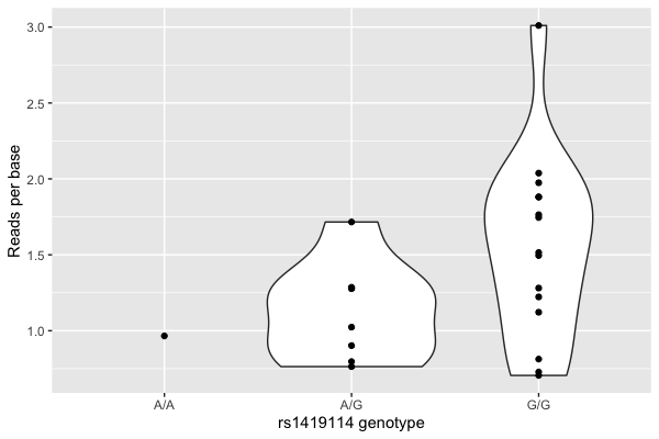
Hmm. There looks visually like a correspondence.
But wait! Maybe that's just to do with how many reads were sequenced?
Normalising read counts
Different runs of the sequencer produce different numbers of reads due to prosaic features to do with library preparation and reagents and so on - producing variation in the counts that has nothing to do with biology. So let's normalise by this number now:
data$reads_per_base_per_million = 1E6 * data$mean_reads_per_base / data$total_reads
Note
I included added a factor of 1 million here just to bring the values back into roughly the right level. The values are the number of reads per base of the gene per million sequenced reads.
For most work of this type you should probably compute TPM instead, which also normalises by gene length. It is an estimate of the proportion of expressed transcripts from that gene. However, we're only interested in one gene here, so we'll stick with this value.
Let's plot again:
p = (
    ggplot( data = data, aes( x = genotype, y = reads_per_base_per_million ))
    + geom_violin()
    + geom_point()
    + xlab( "rs1419114 genotype" )
    + ylab( "Reads per base per million sequenced reads")
)
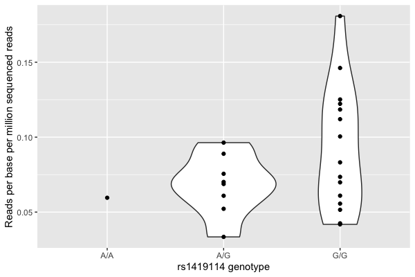
It still looks visually like there's a relationship.
Note
Expression values are often explored after log-transforming them. What difference does that make here?
In what follows I will use 'expression' to mean these normalised expression values - just remember that these are a transformed measurement of the actual expression of the gene.
Running a regression
Now let's estimate the relationship between genotype and mRNA expression by fitting a linear regression model.
To start off let's recode our genotype by the number of G alleles:
data$dosage = 0
data$dosage[ data$genotype == 'A/G' ] = 1
data$dosage[ data$genotype == 'G/G' ] = 2
data$dosage = as.integer( data$dosage )
table( data$dosage )
In R it's easy to fit a linear regression model: use lm():
fit = lm(
    reads_per_base_per_million ~ dosage,
    data = data
)
The best way to look at the result of this is to use the summary() command to pull out the estimated coefficients and standard
errors. You can do that like this:
summary(fit)$coefficients
This will probably produce something like this:
              Estimate Std. Error  t value  Pr(>|t|)
(Intercept) 0.04981156 0.02097038 2.375329 0.0266714
dosage      0.02090930 0.01245827 1.678347 0.1074296
To make sense of this, you have to understand something about the model that is being fit. In math syntax it can be written as follows:
Here and are the two parameters (output in the two rows above) - is the intercept, which captures the average expression values; and is the regression effect size parameter.
Note
should therefore be interpreted as: the estimated increase in expression associated with each additional copy of the 'G' allele. It is often called the association effect size.
All lm does is find the values of and which best fit the data.
Interpreting the regression
So what does this output say? It says that:
- the estimated mean expression level is .
- the standard error of this estimate is .
- the estimated association effect size - that is, the estimated increase in expression with each copy of the 'G' allele - is .
- the standard error of this estimate is .
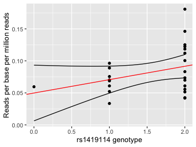
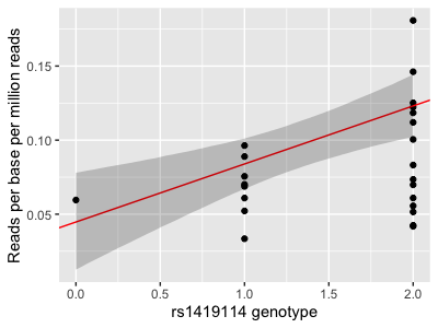
Let's plot this on the above graph:
p = (
    ggplot( data = data, aes( x = dosage, y = reads_per_base_per_million ) )
    + geom_point()
    + xlab( "rs1419114 genotype" )
    + ylab( "Reads per base per million reads")
    + geom_abline( intercept = 0.0498, slope = 0.0209, col = 'red' )
)
print(p)
Important. The regression estimate of is the slope of fitted line.
Question
Which of these statements do you agree with?
- The rs1419114 'G' allele is associated with increased expression of ATP2B4.
- The rs1419114 'G' allele is not associated with increased expression of ATP2B4.
- We can't tell from these data if rs1419114 is associated with expression of ATP2B4.
Visualising the fit
If you did the visualisation tutorial you will have seen a method to get
ggplot2 to add a regression line and confidence interval (using geom_smooth()). How is that added?
The calculation can be done using predict. Specifically let's get it to predict the values and upper and lower confidence
intervals at a range of values from 0 to 2:
x = seq( from = 0, to = 2, by = 0.01 )
interval = predict(
    fit,
    newdata = data.frame( dosage = x ),
    interval = "confidence",
    level = 0.95
)

interval_data = tibble(
    x = x,
    lower = interval[,'lwr'],
    upper = interval[,'upr']
)
print(
    p
    + geom_line( data = interval_data, aes( x = x, y = lower ))
    + geom_line( data = interval_data, aes( x = x, y = upper ))
)
Compare this with geom_smooth:
p + geom_smooth( method = "lm" )
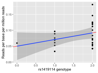
They do... exactly the same thing!
Aside: If you want to get the cool shading from the predict method, that's doable too:
transparent_grey = rgb( 0, 0, 0, 0.2 )
print(
    p
    + geom_ribbon(
        data = interval_data,
        # need to set y here even though not used
        aes( x = x, y = 0, ymin = lower, ymax = upper ),
        fill = transparent_grey
    )
)
Yet another way to do this is to sample some regression lines from the model fit. This is easy with a bit of an approximation. First get the variance-covariance matrix of the parameter estimates:
V = vcov(fit)
Now sample some regression lines from the fitted parameter distribution. To do this let's approximate it by a multivariate
gaussian. The sampling can be done using the mvtnorm package:
library( mvtnorm )
sampled_lines = rmvnorm( 100, sigma = V, mean = c( 0.0498, 0.0209 ) )
Now let's add those sampled lines to the plot:
sampled_lines = tibble(
    a = sampled_lines[,1],
    b = sampled_lines[,2]
)
print(
    p
    + geom_abline(
        data = sampled_lines,
        aes(
            intercept = a,
            slope = b
        ),
        col = rgb( 0, 0, 0, 0.1 )
    )
    + theme_minimal(16) # simpler theme, to make it easier to see
)
Congratulations! You've added 100 samples from the (approximate) posterior distribution to the plot. (What happens if you turn up the number of lines?)
Note. This last way of plotting the regression confidence interval is helpful because it reveals how we think of the regression fit: namely it determines a joint distribution over the parameters.
P-values, standard errors and all that
In the above, the estimate was with a standard error of . What does that standard error mean?
Here are two ways of thinking about it. First, a bayesian interpretation is that this is telling us the approximate posterior distribution of the parameter - that is, what we should believe about the parameter having seen the data. (In this setting, we have to have assumed so that the prior doesn't affect things.). Although the true posterior could be mathematically complex, it's approximately normal with that standard error.
Second, a frequentist interpretation is that the standard error tells us about the sampling distribution of the estimate. To understand this, you have to think not just of the dataset we have loaded, but also imagine what would happen if we (hypothetically) generated lots of other datasets in the same way and re-estimated. Each dataset would generate its own estimate, which would differ a bit from our estimate due to all the random noise and so on. The standard error tells us how much variability we should expect in that estimate. Approximately, we can think of this as saying that the sampling distribution of the estimate is gaussian with that standard deviation.
Note
The posterior distribution of the parameters, and the sampling distribution of the estimate, are not exactly the same. But when there's lots of data they become approximately the same (and both approximately normal) and so for most purposes we can treat them as the same.
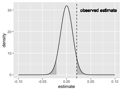
To explore this sampling distribution interpretation, suppose there's actually no association and suppose - hypothetically - we were to repeat the study a zillion times, each time taking a different set of 24 samples (with the same genotypes but different expression measurements). The sampling distribution of the estimate we would obtain would then look approximately like a normal distribution with - that is, like this:
sampling_distribution = (
    tibble(
        x = seq( from = -0.1, to = 0.1, by = 0.001 )
    )
    %>% mutate(
        density = dnorm( x, mean = 0, sd = 0.01245827 )
    )
)

p2 = (
    ggplot( data = sampling_distribution )
    + geom_line( aes( x = x, y = density ) )
    + geom_vline( xintercept = 0.0209, linetype = 2 )
    + geom_text( x = 0.0209, y = 30, label = "observed estimate", hjust = -0.1 )
    + xlab( "estimate" )
    + ylab( "density" )
)
print(p2)

What this is saying is: our estimate is fairly well within the distribution that would be expected if there is no true association. Whichever way you look at this it's hard to get excited about the association.
The P-value
The P-value gives no more information than the beta and standard error.
In fact, it is computed as the mass of the sampling distribution shown above that is 'larger' than the observed beta estimate, like this:
As the plot shows, the P-value that lm() reports is a two-tailed p-value, meaning that it accounts for all values
that are (in either direction). To compute it, just compute this mass:
print(
    pnorm( -0.0209, mean = 0, sd = 0.0125 ) # mass under left tail
    * 2                                     # get right tail too
)
[1] 0.09452432
Because of this mass-under-the-tails definition, the p-value is interpreted as the probability of seeing an effect as large as or larger than the one we actually saw, if there wasn't any true effect.
The real point I am making here is that the P-value gives no new information relative to the estimate and its standard error. If you had to choose what to report, it should be the estimate of and its standard error, because you can compute the P-value form that.
Well not quite normal!
Note. The p-value computed using pnorm() above (0.0095) is almost but not quite the same as the one listed in the regression output.
That's because, for linear regression, the distribution is actually a T
distribution rather than gaussian.
However
- this doesn't matter much for most regression
- it gets less important as the sample size grows
- and it only really applies to linear regression
...so in most cases you won't go far wrong by thinking of it as computed using pnorm() as above.
In any case - whichever way you dice it, this association does not look very exciting, right?
Including covariates
But wait! There's another variable in the data. Specifically, the samples were either from bone marrow from adults or fetal liver. Maybe we should be including that in the regression?
Including covariates is easy in linear regression - this is one of its great strengths. Try it now:
fit2 = lm(
    reads_per_base_per_million ~ dosage + stage,
    data = data
)
summary(fit2)$coefficients
Note
What do these 'fetal' and 'adult' monikers mean? Well, mature red blood cells (erthrocytes) are enucleated - they don't have nuclei. They are basically bags of haemoglobin, and although there might be a few fragments of RNA floating around, it will be pretty degraded. They are not much good for an expression study.
For this study the authors therefore instead worked with haematopoetic stem and progenitor cells (HSPCs) from fetal liver and adult bone marrow, and experimentally differentiated them into proerythroblasts. They then measured expression in these still-nucleated cells.
(This issue of needing to differentiate is why red cells are not found in many expression databases - such as GTEx.)
Your fit might look something like this:
               Estimate Std. Error   t value     Pr(>|t|)
(Intercept)  0.04473606 0.01650016  2.711250 0.0130793191
dosage       0.03918108 0.01086677  3.605588 0.0016614274
stagefetal  -0.04770967 0.01241647 -3.842451 0.0009462768
The model is now:
and we have three parameter estimates.
What has happened?
- The intercept has got slightly lower
- The estimate of is now about twice as large
- The standard error of is smaller
- And the new parameter for fetal/adult status, , is negative.
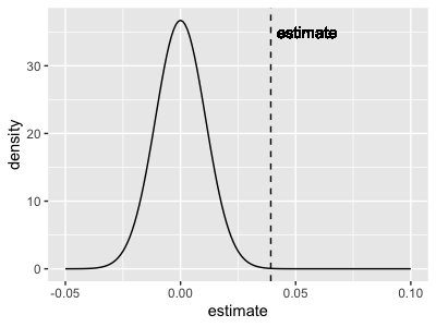
The parameter estimate for the genotype dosage is now - and that's now four times the standard error. As the P-value
shows that's way out in the tail of the sampling distribution.
- Plot code
- Updated plot
p = (
    ggplot( data = data, aes( x = dosage, y = reads_per_base_per_million ) )
    + geom_point()
    + xlab( "rs1419114 genotype" )
    + ylab( "Reads per base per million reads")
    + geom_abline( intercept = 0.04473606, slope = 0.03918108, col = 'red' )
)

sampled_lines = rmvnorm( 10000, sigma = vcov( fit2 ), mean = c( 0.04473606, 0.03918108, -0.04770967 ) )
sampled_interval = tibble(
    dosage = x,
    lower = sapply( x, function(p) { quantile( sampled_lines[,1] + p * sampled_lines[,2], 0.025 ) } ),
    upper = sapply( x, function(p) { quantile( sampled_lines[,1] + p * sampled_lines[,2], 0.975 ) } )
)
print(
    p
    + geom_ribbon(
        data = sampled_interval,
        aes( x = dosage, y = 0, ymin = lower, ymax = upper ),
        fill = transparent_grey
    )
)

# Plot the tail distribution
sampling_distribution = tibble(
    x = seq( from = -0.05, to = 0.1, by = 0.001 )
)
sampling_distribution$density = dnorm( sampling_distribution$x, mean = 0, sd = 0.01086677 )

p2 = (
    ggplot( data = sampling_distribution )
    + geom_line( aes( x = x, y = density ) )
    + geom_vline( xintercept = 0.03922, linetype = 2 )
    + geom_text( x = 0.03922, y = 35, label = "estimate", hjust = -0.1 )
    + xlab( "estimate" )
    + ylab( "density" )
)

lower_tail = which( sampling_distribution$x <= -0.03922 )
upper_tail = which( sampling_distribution$x >= 0.03922 )

print(
    p2
    + geom_area( data = sampling_distribution[ lower_tail, ], aes( x = x, y = density ), fill = transparent_grey )
    + geom_area( data = sampling_distribution[ upper_tail, ], aes( x = x, y = density ), fill = transparent_grey )
)
Question
Which of these statements do you agree with now?
- The rs1419114 'G' allele is associated with increased expression of ATP2B4.
- The rs1419114 'G' allele is not associated with increased expression of ATP2B4.
- We can't tell from these data if rs1419114 is associated with expression of ATP2B4.
Should we include the stage as a covariate, or shouldn't we?
How good is the fit?
Before moving on we ought to check that the model is at all sensible for the data.
One way to do this is the quantile-quantile or *qq plot**. The qqplot is used to compare an expected distribution (which, in this case, can be the fitted distribution of the expression values) to the actual observed distribution.
To do this let's examine the residuals - that is, the difference between the observed values and the fitted straight-line model. If the model is accurate, these residuals should look like 'gaussian noise' - i.e. be as if drawn from a Gaussian distribution. We can check this by comparing them to quantiles of a gaussian now:
qq_data = tibble(
    observed = sort( fit2$residuals ),
    expected = qnorm(
        1:nrow(data)/(nrow(data)+1),
        sd = sigma( fit2 )              # sigma() is the fitted residual standard error
    )
)
print(
    ggplot(
        data = qq_data,
        aes( x = observed, y = expected )
    )
    + geom_point()
    + geom_abline( intercept = 0, slope = 1, colour = "red" )
)
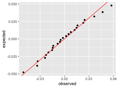
This plot says the fit is pretty good.
If you want to go further than this, one way is to compute a P-value comparing the distribution of residuals against the fitted model.
Challenge Question
Compute a P-value for the residuals against the fitted model.
Hint if the residuals are gaussian with variance , then their sum is gaussian with variance equal to . How far out in the tail is the sum of observed residuals?
Next steps
Now let's look at a slightly different example using logistic regression.