Causal thinking
In the linear regression example we saw some pretty odd behaviour. A model fit of genotype on expression gave no very strong evidence for association, yet when we included a covariate this changed and there seemed to be an effect.
To figure out why this might be we need to think causally.
Three worlds
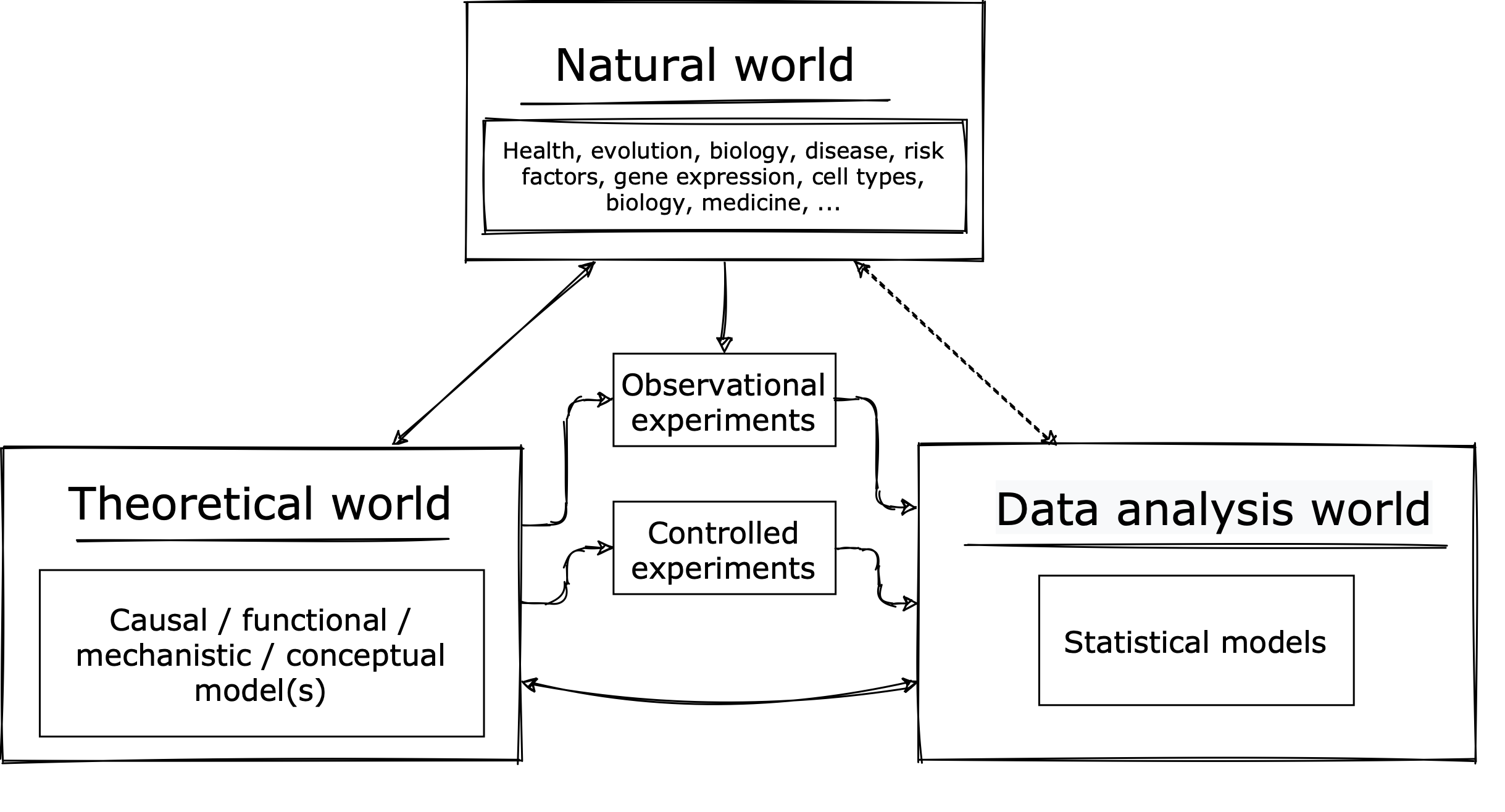
To start, let's look at the 'three worlds' of scientific inference:

The first world is the natural world - that's what we want to know about. This world contains all the wonders of life, but also all the annoying and fiddly bits.
The second world is the theoretical world - that's where we build scientific theories - simplified models of how the world works. This world is much cleaner and more simple than the real world. Arguably this is where advances in scientific understanding really happen.
The third scientific world is the one we've been working in - data analysis world. Here we have data and apply statistical models. The aim is to help us distinguish between our scientific theories.
Linking these worlds are experiments - either purely observational experiments, which measure variables on real-world populations, or controlled experiments which are typically much more theoretically controlled. Experiments generate data relevant to scientific models that can then be tested using data analysis methods.
The point of this diagram is that, while there are some settings where purely knowing correlations between variables is useful, what we want to know most is how the world works. Statistical models typically don't tell us that without the scientific theories that motivate them. In this tutorial we'll see how that plays out in a purely simulated example.
Causal graphs
Let's look at a simple way to represent a functional / mechanistic model: causal graphs.
A causal graph is made up of nodes which stand for quantities of interest and arrows between nodes. An arrow between two nodes means that one causes or causally affects the other.
For example
means "X causally affects Y": changing would affect . (The graph alone does not say anything about how affects , or how strong the effect is - just that there is an effect.)
The other important point is that variables and arrows that don't appear in the graph are assumed not to be there. Thus, in the above graph, changing would definitely not affect (as there's no arrow or path from to .) Similarly, in this diagram:
we can be sure that all of the causal effect of on is through , and not via some other path.
An exercise: three variables
To get a sense of this, let's consider the simplest nontrivial case: three variables. Specifically, let's imagine that we are interested in estimating the (causal) effect of some exposure variable (for example, a genotype or a new drug) on an outcome (which could be a disease trait, or a biomarker, for example.). But there is a third variable that might be causally related to and/or . Should we condition on or not?
To make this concrete, let's consider a set up where
- , , and are each gaussian variables with variance .
- all causal effects are linear and equal to .
In other words = means - where is a gaussian variable with just the right variance to make have variance .
Question
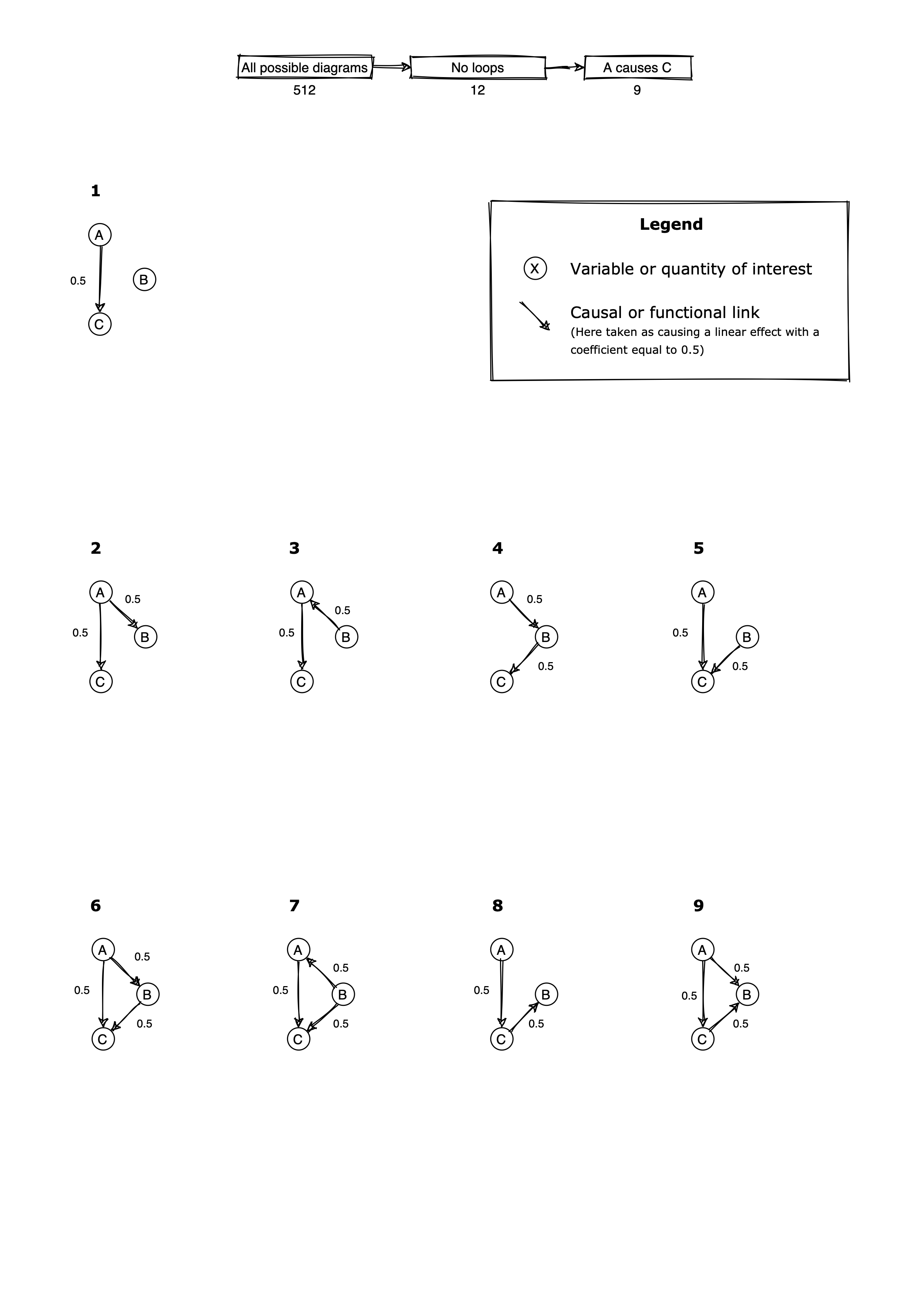
Consider the nine causal diagrams below:

Suppose all variables are gaussian with variance 1, all effects are linear and all effect sizes are 0.5.
For each diagram, first try to decide by looking at the diagram whether you think should be included or not. (Or maybe it doesn't matter?)
Second, try downloading loading the matching dataset from this
folder
and use lm() in R to check your answer is right. More precisely, what is the impact of including in as a covariate on a) the
regression estimate and b) the standard error of conditioning on ?
Question
Can you figure out which of the diagrams are observationally equivalent? (That is, they produce identical data distributions?)
Note. In these examples, all variables are gaussian with mean zero and variance 1, and all effects are linear. Thus the joint data distribution is fully determined by the covariances between the three variables.
See if you can complete these before going further.
Worked example
As an example let's analyse diagram #8, which stretched out looks like:
Let's simulate from this model now. I'll simulate a very large sample size so that we can get accurate estimates:
A = rnorm( 100000 )
C = 0.5 * A + rnorm( 100000, sd = sqrt(0.75) )
B = 0.5 * C + rnorm( 100000, sd = sqrt(0.75) )
When I fit the example dataset I get this:
> l = lm( C ~ A ); summary(l)$coeff
                Estimate  Std. Error     t value  Pr(>|t|)
(Intercept) -0.001401156 0.002739580  -0.5114491 0.6090377
A            0.497460492 0.002744025 181.2886108 0.0000000

> l = lm( C ~ A + B ); summary(l)$coeff
                Estimate  Std. Error     t value  Pr(>|t|)
(Intercept) -0.001249272 0.002451502  -0.5095947 0.6103366
A            0.399875908 0.002532207 157.9159381 0.0000000
B            0.398648014 0.002527165 157.7451237 0.0000000
So fitting the model with in gives us estimates of around 0.4 - for both and - yet the causal effects were and ! What's going on?
Well, this model corresponds to the following formula:
(where, as before, is chosen so that has variance and similarly for .)
The unadjusted linear regression estimate is (it is equal to the covariance between and .). This is indeed the causal effect.
The adjusted estimate is different - but it still gets the contribution of right. Because since the fitted contribution of to is:
In other words, the regression has made a perfectly sensible estimate - it just doesn't understand that it's the effect of on that we are interested in.
One way to understand this is to say that some of the association with is 'explained by' - and in this case the estimate for is positive because also 'explains' some of the noise in .
Note. Diagram 2 is sort of similar in that is correlated to . In this case, however, there's a different behaviour:
A = rnorm( 10000 )
B = 0.5 * A + rnorm( 10000, sd = sqrt( 0.75 ))
C = 0.5 * A + rnorm( 10000, sd = sqrt( 0.75 ))
> l = lm( C ~ A ); summary(l)$coeff
               Estimate  Std. Error    t value  Pr(>|t|)
(Intercept) 0.003590284 0.008678783  0.4136851 0.6791136
A           0.506865138 0.008710480 58.1902630 0.0000000

> l = lm( C ~ A + B ); summary(l)$coeff
               Estimate  Std. Error    t value   Pr(>|t|)
(Intercept) 0.003520708 0.008677774  0.4057155 0.68496031
A           0.497305419 0.010094251 49.2662029 0.00000000
B           0.018778370 0.010023912  1.8733575 0.06104819
In this case including does not alter the point the estimate of on . One way to understand this is that has no other component of in it (other than ), so all of the association of with is 'explained' by . This leads to the coefficient of being close to zero. However, including has imnpacted the precision of our estimate: the standard error for has changed from 0.0087 to 0.010. This might not look very much but look at its effect on the z-score (i.e. how many standard errors away from zero the estimate is):
> 0.506865138/0.008710480
[1] 58.19026
> 0.497305419/0.010094251
[1] 49.2662
Including has made the estimate about less certain, by about 10 standard errors.
In this example with 10,000 samples, both estimates are anyway very many standard errors away from zero, but clearly including is adding to the uncertainty of our estimate.
Hint
The effect sizes we are looking at here are very strong! (Each effect explains of the variance of the target variable). Try reducing the sample size to 100 to see how this affects the resulting P-value.
Observational equivalence
One of the important things to realise is that more than one causal model can produce the same observable data. This puts limits on the extent to which the data can help us distinguish scientific theories.
An example of this in the above are diagrams 6 and 7. We can check this by following through the definitions in each diagram to compute variable covariances:
A full computation of in diagram 6 looks as follows:
Note
This calculation uses the key properties of covariance, namely:
is bilinear, so linear changes to either of the variables can be split out, e.g.:
- if is a number,
- .
- And similarly for changes to the 2nd variable.
The covariance between any two independent quantities is zero.
And by definition .
If the above calculation seems too hard, don't worry! In general in these diagrams the covariance can be read off by simply following all paths between two variables (regardless of arrow direction) and multiplying coefficients. So in this example, there are two undirected paths that connect to - one has coefficient ) and the other has coefficient , ergo, the total covariance is .
However there is one exception to this rule about following all paths. A path that is "blocked" by a collider - i.e. a variable where two arrows collide:
doesn't contribute to the covariance.
Note
Why is this? Hint. follow through the contributions of variables to the collider - you should be able to see that unlike other nodes that join two other variables, the collider does not generate a shared component to the incoming variables.
Question
Which variables are colliders in diagram 6 and 7?
Confounding
The fact that diagrams 6 and 7 are observationally equivalent is particularly important for the following reason.
In diagram 6, variable is part of a causal path from to . The full causal effect of on is 0.75, and this is what we get from an unadjusted estimate of on . Thus in diagram 6 we should not control for . (Although if we were specifically interested in just the direct effect of , we could control for .)
However in diagram 7, variable is not part of a causal path from to . The full causal effect of on is 0.5. If we do not include in our estimate, we get an inflated estimate of the effect equal to 0.75. In this case is known as a confounding variable or a confounder - more generally we say the estimate of on is confounded by the path through . To accurately estimate causal effects it is mandatory to control for the confounding variable.
Warning
To get an accurate estimate, you must control for confounders.
However - the surprising thing here is that, as we saw above, diagrams 6 and 7 are observationally equivalent. Therefore, we can't tell from the data whether is a confounder or not!
Conclusion
The only way to tell whether should be included or not in diagrams 6-7, is through our scientific knowledge about what , and represent - that is, what the true causal diagram is.
Diagram 9: colliders
Finally let's look at diagram 9. In diagram 9, variable is a collider (two arrows meet at it). Let's simulate that now:
A = rnorm( 10000, sd = 1 )
C = 0.5 * A + rnorm( 10000, sd = sqrt(0.75) )
B = 0.5 * A  + 0.5 * C + rnorm( 10000, sd = sqrt(0.5) )
l = lm( C ~ A ); summary(l)$coeff[,1:2] Estimate Std. Error t value Pr(>|t|) (Intercept) -0.0008303819 0.008687452 -0.09558405 0.9238528 A 0.4895884550 0.008781247 55.75386231 0.0000000
> l = lm( C ~ A + B ); summary(l)$coeff
               Estimate  Std. Error    t value     Pr(>|t|)
(Intercept) -0.00203657 0.007387861 -0.2756643 7.828116e-01
A            0.06833455 0.010105579  6.7620615 1.436458e-11
B            0.55480287 0.008967174 61.8704222 0.000000e+00
In this diagram conditioning on gets the answer completely wrong.
In some ways this is like diagram 8 that we studied above. However, this collider example is even more insidious because it can generate completely spurious effects. (Whereas the problem in diagram 8 only occurs if actually contributes to - that is, if there is a nonzero causal effect in the first place.). To see that we can try again with zero effect:
A = rnorm( 10000, sd = 1 )
C = rnorm( 10000, sd = 1 )
B = 0.5 * A  + 0.5 * C + rnorm( 10000, sd = sqrt(0.5) )
> l = lm( C ~ A ); summary(l)$coeff
                Estimate  Std. Error    t value  Pr(>|t|)
(Intercept) -0.001944327 0.010010210 -0.1942344 0.8459963
A           -0.017850158 0.009992815 -1.7862993 0.0740811

> l = lm( C ~ A + B ); summary(l)$coeff
                Estimate  Std. Error     t value      Pr(>|t|)
(Intercept) -0.003406093 0.008153387  -0.4177518  6.761375e-01
A           -0.351401096 0.009390186 -37.4221675 5.732243e-287
B            0.669783192 0.009403352  71.2281297  0.000000e+00
In both cases the estimate conditional on gets the estimate of completely wrong.
Warning
To get an accurate estimate, you must not control for colliders.
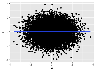
To understand this behaviour, let's keep this last dataset with zero causal effect of on and let's plot the variables:
plot_data = tibble( A = A, B = B, C = C )
print(
    ggplot( data = plot_data, aes( x = A, y = C ))
    + geom_point()
    + geom_smooth( method = "lm" )
)

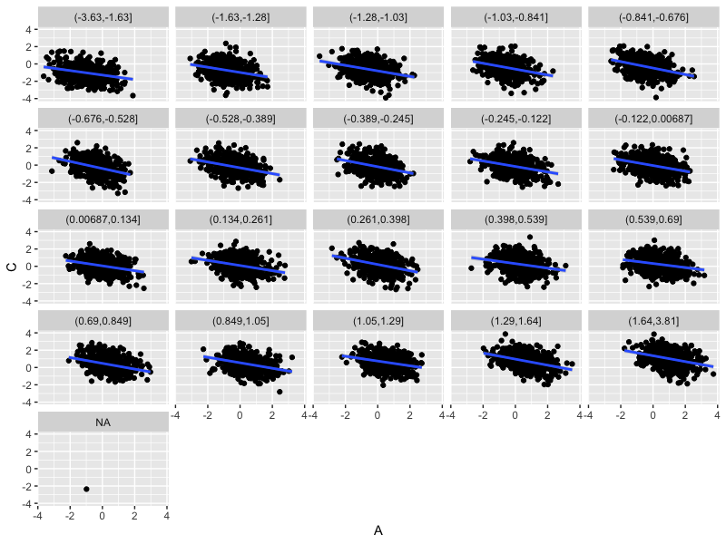
This looks as expected. But now let's look at the same thing within strata of fixed :
plot_data$B_quantile = cut( plot_data$B, quantile( B, seq( from = 0, to = 1, by = 0.05 )))
print(
    ggplot( data = plot_data, aes( x = A, y = C ))
    + geom_point()
    + geom_smooth( method = "lm" )
    + facet_wrap( ~ B_quantile )
)

For fixed values of , the association between and is drastically different - much closer to zero.
You can see why this is: since , for a fixed value of there must be a negative relationship between and :
Controlling for in the regression is like looking at the effect of on within strata like this - it 'soaks up' the global effect of .
Question
In the actual diagram 9, this effect is tempered by the fact that does have an effect on . How do the plots look if you simulate from diagram 9?