A bayesian forest plot
The plot we just made is ok, but surely visually pretty wasteful.
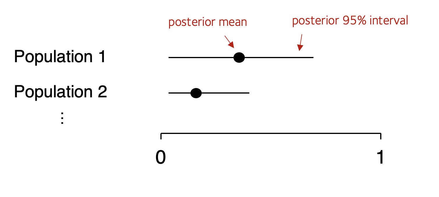
For most purposes a better alternative is forest plot - that is a plot showing point estimates and their 95% credible intervals.
Making a forest plot
Challenge question
Create a forest plot for these estimates, that is, a plot of the posterior mean estimates and the 95% intervals. Schematically it should look schematically something like this:

For extra kudos, make a version with a prior (e.g. , for example, or a prior of your choice) and compare to the without-prior version.
Forest plot 'howto'
In case you're stuck here is a guide.
First, instead of that function compute_posterior_density(), write a simpler function compute_posterior_summary() that summarises the posterior, like this:
compute_posterior_summary = function(
    nA, nB,
    prior = c( nA = 0, nB = 0 )
) {
    return(
        data.frame(
            posterior_mean = # your calculation here
            q2.5 = # your calculation here
            q97.5 = # your calculation here
        )
    )
}
As indicated, it should return the data we need for the forest plot. (Returning this as a dataframe with one row works best). The columns should be the posterior mean and - to find an interval containing 95% of the mass - the 2.5% and 97.5% quantiles. (Feel free to add other quantiles as well - for example the 50% quantile, which is also known as the median.)
Note
If you're working in R, you can compute the quantiles using the qbeta() function. For example to get the 2.5% quantile:
qbeta( p = 0.025, shape1 = nB+1, shape2 = nA+1 )
(though you should also add the prior information in, of course!)
Happily, it turns out that the posterior mean is just the frequency estimate you would have made from the data anyway:
...so that's easy to compute as well.
Once you've written your function, you could use it like this to compute a summary:
posterior_summary = (
    data
    %>% mutate(
        nA = ( `C/C` + `-/C` ),
        nB = ( `-/-` )
    )
    %>% group_by( population )
    %>% summarise( compute_posterior_summary( nA, nB, prior = c( nA = 0, nB = 0 )))
)
You should end up with a data frame looking something like this:
population            n1    n2   posterior_mean   q2.5   q97.5
African Ancestry SW   32    29            0.475  0.355   0.599
(etc).
Now let's change the plotting code so it plots a forest plot. See the comments below for an explanation
p = (
    ggplot( data = posterior_summary )
    + geom_point( aes( x = posterior_mean, y = population ))
    + geom_segment( aes( x = q2.5, xend = q97.5, y = population, yend = population ))
    # Always make your plot have good axis labels!
    + xlab( "Posterior mean and 95% CI" )
    + ylab( "Population" )
    # A clean, large-font theme:
    + theme_minimal(16)
    # Rotate y axis label so it's not at 90 degrees:
    + theme( axis.title.y = element_text( angle = 0, vjust = 0.5 ))
)
print(p)
Note. If the points are not in order, you can order them in the data before re-running the above.
Question
Which plot do you like better - the full posterior or this one?
Do the 95% intervals all overlap?
Comparing the inference
Compare the bayesian shinkage and non-shrinkage estimates by plotting different values side-by side. Here is an easy way to do this:
- Update the above code to add an extra column called
priorto theposterior_summarydata frame. The above had no prior data, so give it the value 'none'. - Now add extra rows to
posterior_summaryfor a chosen different prior - saynA=5,nB=5or other values of your choice. (Make sure to change thepriorcolumn to something different, like '5,5'!)
Note. the rbind() function in R (as well as dplyr::bind_rows()) will concatenate two data frames, row-wise.
- Lastly, try re-making your plot but adding
+ facet_grid( . ~ prior )
into the ggplot command to put the two plots side by side.
Investigating a sickle modifier
Challenge
(rs61028892 is a single nucleotide polymorphism which has been associated with control of fetal haemoglobin in individuals with sickle cell disease.) Can you repeat this fores tplot for the variant?
You can find the rs61028892 data here.
Note. Unlike the O blood group example, for this SNP it probably makes sense to compute the allele frequency directly using the counts from the homozygote and heterozygote individuals, something like this:
(
    data
    %>% mutate(
        nA = 2 * rs61028892_0 + rs61028892_1,
        nB = 2 * rs61028892_2 + rs61028892_1 +
    )
)
See if you can make a forest plot of this variant across populations.