Estimating allele frequencies
Let's use Bayes to estimate allele frequencies - quantifying our uncertainty - for a couple of important variants in global populations. Here are the datasets:
- Data on the O blood group variant (rs8176719): O blood group data
rs8176719 has two alleles - the functional 'C' allele, and a deletion allele that results in a frameshift. Individuals that have two copies of the deletion have 'O' blood group.
- Data on rs61028892, a variant that has been associated with control of fetal haemoglobin in individuals with sickle cell disease: rs61028892 data
Both datasets above come from the 1000 Genomes Project Phase 3 dataset.
You should be able to load these into R like this:
library( tidyverse )
data = readr::read_tsv(
    "https://raw.githubusercontent.com/chg-training/chg-training-resources/main/docs/statistical_modelling/introduction/data/1000_genomes_o_blood_group_grouped.tsv"
)
Challenge
Load one or both of these datasets into R using read_tsv(). Then use dbeta() to plot the posterior distribution of
the allele frequency and/or the O blood group frequency across all populations and then in individual populations.
Hint. ggplot() is one good way to do this. Some further tips on this are below.
Challenge
Add the posterior mean and lower and upper values forming a 95% credible set to the data frame.
Add 95% credible intervals for each population to the data frame, using qbeta(), and then plot these as the estimates
(points) and 95% confidence intervals
Plotting the posterior
To get ggplot() to plot a posterior density for the whole dataset, or for individual populations, is not conceptually difficult - we're just plotting the beta distribution after all. But it does require a bit of complexity in terms of code. In short, ggplot() takes a single data frame as data, so you have to build a big dataframe that represents the posterior density at a grid of x axis values, for each population you want to plot.
Here's one way that is fairly re-useable. Let's write a function that reads in one row of data and generates the dataframe we need. Rather than hard-code this for the O blood group example, we'll make it work with generic counts and (which we can set to the counts of the non-O and O blood group genotypes):
compute_posterior_density = function(
    nA, nB,
    at = seq( from = 0, to = 1, by = 0.01 ),
    prior = c( nA = 0, nB = 0 )
) {
    # I'm using tidyverse's version of a dataframe, called 'tibble':
    tibble::tibble(
        nA = nA,
        nB = nB,
        at = at,
        # Compute the posterior using `dbeta()`
        posterior = dbeta(
            at,
            shape1 = nB + prior['nB'] + 1,
            shape2 = nA + prior['nA'] + 1
        )
    )
}
For example, for the O blood group data you could apply this to the whole dataset like this:
data = readr::read_tsv(
    "https://raw.githubusercontent.com/chg-training/chg-training-resources/main/docs/statistical_modelling/introduction/data/1000_genomes_o_blood_group_grouped.tsv"
)

print( data )

overall_posterior = compute_posterior_density(
    nA = sum(data$`C/C` + data$`-/C` ),
    nB = sum(data$`-/-`),
    at = seq( from = 0, to = 1, by = 0.001 )
)
If you print this, you should see a data frame with 101 rows (one for each of those at values) showing the posterior distribution.
Note
Make sure you understand what that data frame is showing. To recap, it's the posterior distribution of the frequency of O blood group across all populations, evaluated at a grid of 101 points between zero and one.
The posterior is a beta distribution so we used dbeta() to compute it.
Want to plot it? No problem!
p = (
    ggplot(
        data = overall_posterior,
        aes( x = at, y = posterior )
    )
    + geom_line()
)
print(p)
Ok that's not good enough. Let's zoom in:
print( p + xlim( 0.35, 0.55 ) )
Challenge
Ok that's not good enough either. Here are some things you should do to fix it.
Does your plot look kind of jagged-y? Why? Go back and fix it now!
You ought to give your plots meaningful x axis and y axis labels. (Otherwise you'll just waste people's time making them ask what they are). The
xlab()andylab()functions can be used for this - add some now.Adding
+ theme_minimal()will get rid of the grey background, for a cleanrer plot.Personally, I never like the way the y axis label is printed at 90 degrees to the reading direction - do you? That can be fixed too with a bit of ggplot magic. I always have to look this up in the documentation so here it is for reference:
print(
    p
    + theme_minimal(16)
    + theme(
        axis.title.y = element_text( angle = 0, vjust = 0.5 )
    )
)
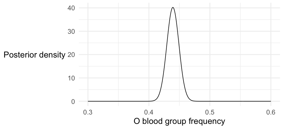
Challenge Put all this together to make a final plot of the posterior distribution, centred near now. It should look something like this:

Congratulations!
Plotting multiple populations
Well, but who cares about the average O blood gorup frequency globally? Much more interesting, let's plot the posterior in each population. This should be easy - we just somehow need to call compute_posterior_density() for each row of our data, instead of for the whole set. Here's how:
Computing posteriors per population
- Using a loop
- Using reframe()
A boring way to do this is write a loop that runs through the rows and accumulates the results. There's some code below that does it.
But if you've followed any of our earlier tutorials you'll know there's often a simpler, more expressive way to do things in dplyr - and there is here too. See the second tab for a much slicker version.
per_population_posterior = tibble()
for( i in 1:nrow( data )) {
    # summarise just one row
    row = (
        data[i,]
        %>% mutate(
            nA = ( `C/C` + `-/C` ),
            nB = ( `-/-` )
        )
    )
    per_population_posterior = bind_rows(
        per_population_posterior,
        cbind(
            population = row$population,
            compute_posterior_density( row$nA, row$nB )
        )
    )
}
Luckily dplyr() has a function that works for this case - reframe().
reframe() works a lot like summarise() but allows us to output a whole dataframe per input row.
We'll use it with pick() which lets us pass in just the two variables we need.
So like this:
per_population_posterior = (
    data
    %>% mutate(
        nA = ( `C/C` + `-/C` ),
        nB = ( `-/-` )
    )
    %>% group_by( population )
    %>% reframe( compute_posterior_density( nA, nB ))
)
If you look at per_population_data you should see it now has thousands of rows (or tens of thousands if you increased the number of at values), with the same number of rows per population. You could count them like this:
per_population_posterior %>% group_by( population ) %>% summarise( number_of_rows = n() )
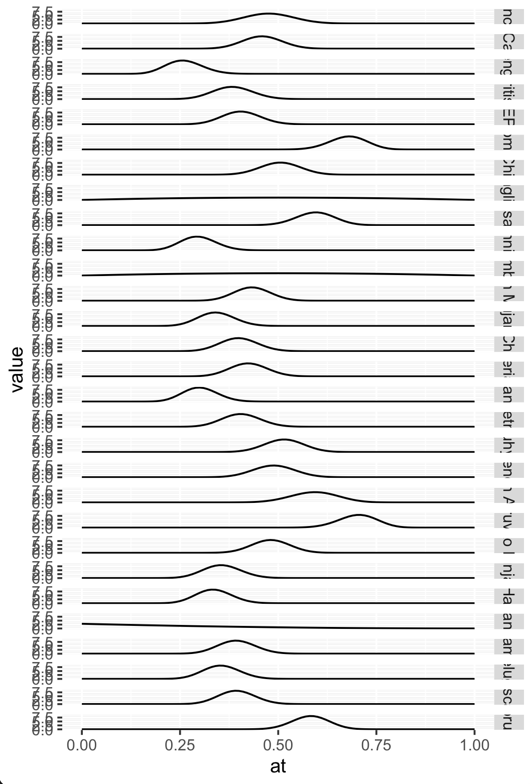
Getting ggplot to plot this is now easy - we use a facet:
p = (
    ggplot( data = per_population_posterior )
    + geom_line( aes( x = at, y = posterior ))
    + facet_grid( population ~ . )
)
print(p)

Cool!
Note on facet_grid()
That facet_grid() call works like this. You give it two variables to facet over, written like variable1 ~ variable2. These variables are mapped to rows and columns of the resulting plot. (In our case, we just want to facet over one variable rows, so we do population ~ .).
ggplot() then does all the work of splitting up the data up into each of the facets and arranges the plot into rows and columns. It's a very powerful feature for quickly exploring datasets.
As usual, this initial plot isn't quite good enough to start with. We should do several things:
- Those y axis scales are useless - too hard to see. We should get rid of them.
- The facet labels (on the right) are useless as well! We can't see the population names.
- A more subtle bug is that the posteriors all have slightly different heights (depending on how spread-out the distribution is). But at the moment they all have the same scale.
All this can be fixed with suitable calls to ggplot. Let's put this in a function for easy re-use - see the comments in the function for more info:
plot_posterior <- function( per_population_posterior ) {
    result = (
        ggplot(
            data = per_population_posterior,
            aes( x = at, y = posterior )
        )
        + geom_line()
        + facet_grid(
            population ~ .,
            # Make y axis facets have their own scales, learnt from the data
            scales = "free_y"
        )
        + theme_minimal(16)
        + xlab( "O blood group frequency" )
        + ylab( "Posterior density" )
        + theme(
            # remove Y axis tick labels
            axis.text.y = element_blank(),
            # rotate facet labels on right of plot
            strip.text.y.right = element_text(angle = 0, hjust = 0),
            # rotate overall y axis label 90
            axis.title.y = element_text(angle = 0, vjust = 0.5)
        )

    )
    return( result )
}

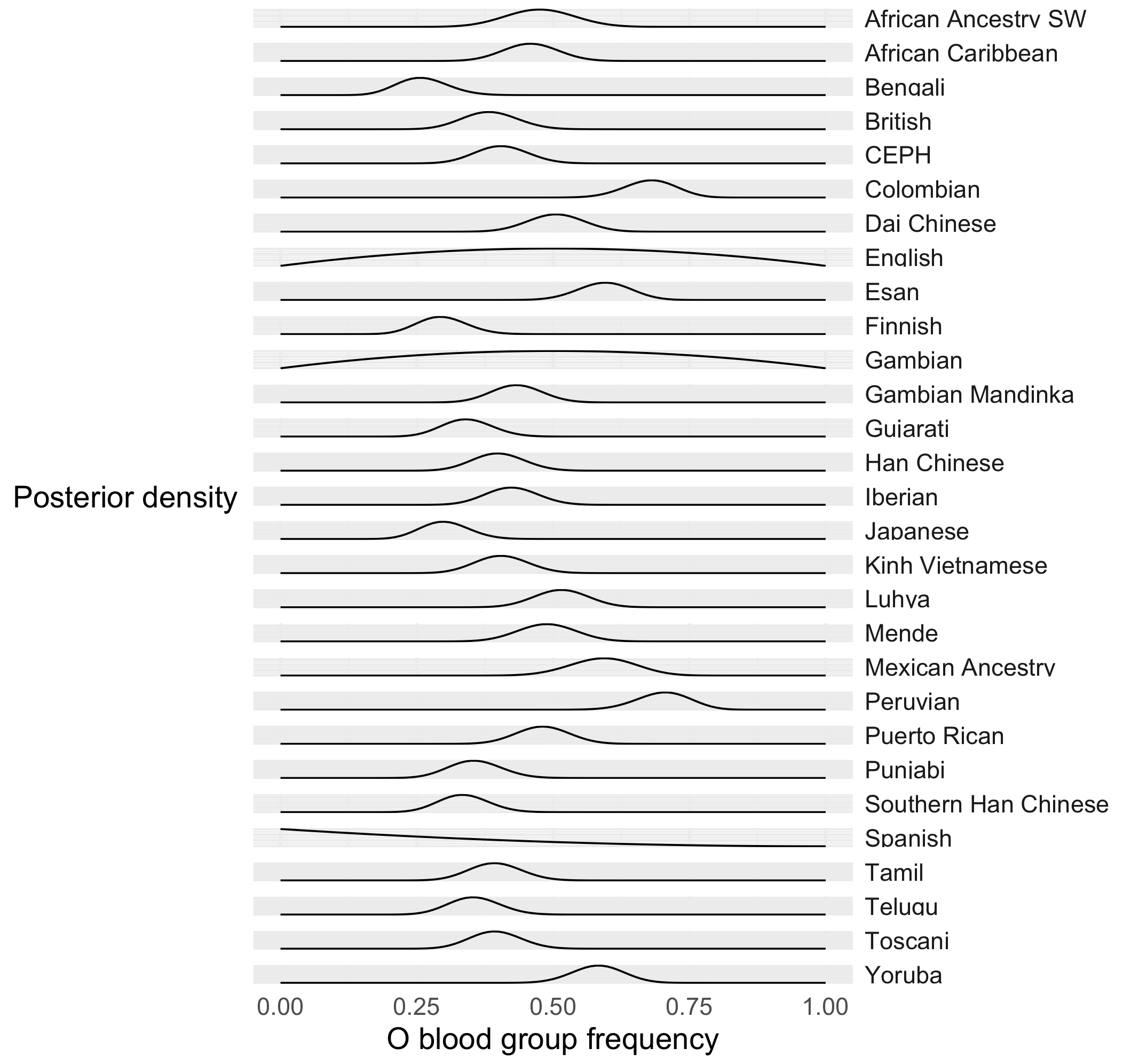
plot_posterior( per_population_posterior )

Question
What's going on with those populations, like the Spanish or the English, with very spread-out distributions?
Ordering populations
That's all very well, currently the populations are sorted in alphabetical order. Wouldn't it be nicer to order the populations by allele frequency?
The way to do this in ggplot is not obvious at first glance - you have to re-order the data itself. In R, there is a specific way to do this known as a factor. A factor is a set of string values that take one of a set of levels. You specify the order of the levels, and voila, the data is ordered.
Let's do that now. First let's compute the frequency in the original data:
data$O_bld_grp_frequency = data[['-/-']] / ( data[['C/C']] + data[['-/C']] + data[['-/-']])
Now let's use that to get an ordered list of populations. An easy way is to use the dplyr arrange() function to order the dataframe by the frequency, then get the populations:
ordered_populations = (
    data
    %>% arrange( O_bld_grp_frequency )
)$population
Finally, we'll convert the population column of per_population_posterior (and the original data) to a factor with these levels:
data$population = factor( data$population, levels = ordered_populations )
per_population_posterior$population = factor( per_population_posterior$population, levels = ordered_populations )
That's it! (If you try str(data) you'll see that the population column is now a factor.)
Now if you regenerate the above plot, things should be in order.
Question
In which populations is O blood group at lowest frequency? In which populations at highest frequency?
Bayesian shrinkage
So far we have been ignoring the prior - the prior was effectively a flat distribution. But let's imagine now we had some prior data in each population. Say, 20 observations of each allele.
prior.data = c( nA = 0, nB = 0 )
per_population_posterior = (
    data
    %>% mutate(
        nA = ( `C/C` + `-/C` ),
        nB = ( `-/-` )
    )
    %>% group_by( population )
    %>% reframe( compute_posterior_density( nA, nB, prior = prior.data ))
)
plot_posterior( per_population_posterior )
Question
Compare this to your earlier plot.
What has happened to the posteriors? Are they more or less spread out than before?
Which populations were affected the most by this?
What you are witnessing here is bayesian shrinkage. The strong prior information has helped make all the estimates more similar, even though the data differs in each population.
Compare the prior data to the sample sizes in each population.
Question
What is happening to the Spanish population? Is the estimate with or without a prior more sensible?