The R tidyverse
Base R is ok but it can be a bit... clunky. For many of the tutorials we wil use a set of
packages called "tidyverse" which make life smoother for your
analyses. If you've successfully installed R then this should be easy: in your R session
type
install.packages( tidyverse )
(You might have to select a CRAN mirror at this point - for best results choose one geographically close to you.)
Testing it out
tidyverse is in fact a meta-package - a package that exists to install a bunch of other packages.
Now you can try them out. One of the packages is the tibble package that implements a nice data
frame data type. Try it like this:
tibble::tibble( a = 1:10, b = 10:1 )
The output will be a tibble: a data frame with two columns called a and b each with the
values 1-10 in them, and both of type <int> (which means integer, i.e. positive or negative
whole numbers.).
Another useful part of this is the dplyr package that lets you
manipulate data frames. For example we could filter the above data frame like this:
X = tibble::tibble( a = 1:10, b = 10:1 )
dplyr::filter( X, a > 5 & b > 3)
Lo and behold, only the selected rows are returned! Wow.
When you get bored of typing all those ::s, a simpler way is to load the libraries into the
current environment. So for example we could do instead:
library( tibble )
library( dplyr )
X = tibble( a = 1:10, b = 10:1 )
filter( X, a > 5 & b > 3)
(But in real code it's often nicer just to specify - that way you know what package the function comes from.)
Another way to plot
As a final example here's another way to plot, courtesy of the ggplot2
package. This provides a consistent way to generate plots from data
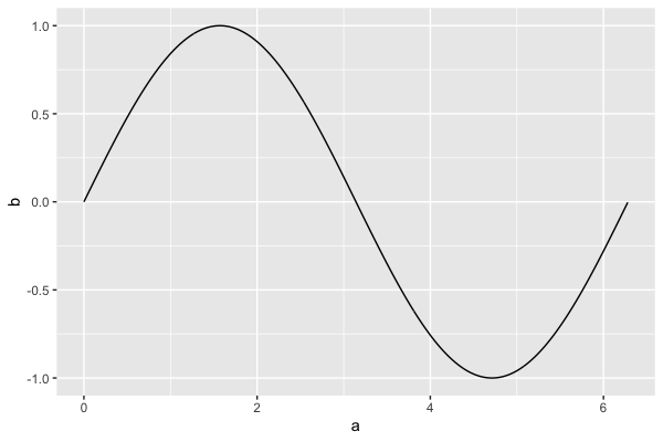
that is well-organised in data frames. Let's reconstruct our sin example:
library( ggplot2 )
x = seq( from = 0, to = 2*pi, by = 0.01 )
X = tibble( a = x, b = sin(x))
myplot = ggplot( X ) + geom_line( aes( x = a, y = b ))
print(myplot)

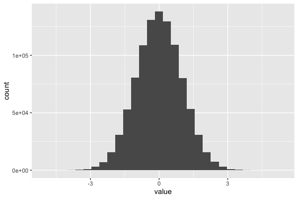
or the histogram example:
X = tibble( value = rnorm( 1000000 ))
myplot = ggplot( X ) + geom_histogram( aes( x = value ))
print(myplot)

The advantages of ggplot over base R might not be obvious to you from these examples.
One advantage is that the plot becomes an object (myplot in the above) that you can further
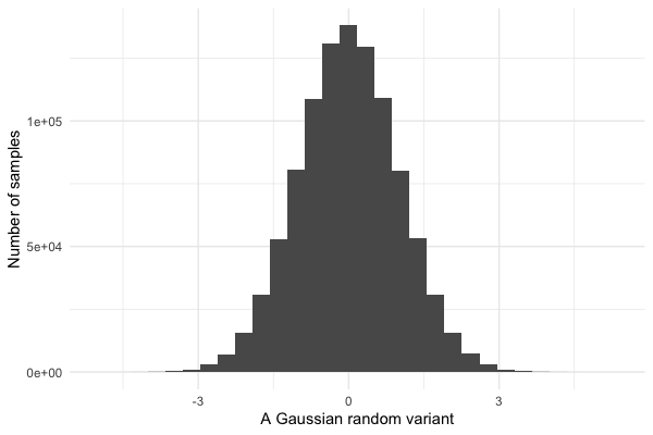
manipulate. For example let's plot that again with some stylistic improvements:
print(
  myplot
  + xlab( "A Gaussian random variant" )
  + ylab( "Number of samples" )
  + theme_minimal()
)

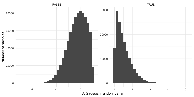
Lots of other alterations can be made to the plot like this. For example, let's split it so we can better see the upper tail of the distribution:
print(
  myplot
  + xlab( "A Gaussian random variant" )
  + ylab( "Number of samples" )
  + theme_minimal()
  + facet_wrap( ~(value > 1), scales = "free" )
)
