Genetic drift
The Wright-Fisher model is about the simplest population-genetic model there is. It consists of:
- A population of N individuals (which stays fixed over time).
- non-overlapping generations
- in each generation, each individual 'samples' its parent uniformly from individuals in the parent generation.
It's pretty simple to implement, but even so it turns out to have many of the key features of real populations. We are going to implement it.
Getting started
As stated above there isnt really anything about genetics in the model. So to give ourselves some genetic data to work with, we'll also generate a set of haplotypes and have them evolve through the model.
Let's get started.
Generating a starting set of haplotypes
Let's imagine we are looking at set of L = 20 SNPs to start with and that there are (say) up to 10 different haplotypes in our population at the start of the simulation:
L = 20
H = 10
haplotypes = matrix( NA, nrow = H, ncol = L )
To generate some simple haplotypes to look at, let's take a simple situation in which the variants are all biallelic (we'll encode the alleles as 0 or 1), they all start off independent of each other, and they all have 20% frequency. We can simulate using rbinom() like this:
haplotypes[,] = rbinom( n = H*L, size = 1, prob = 0.2 )
Here's function to make a quick plot of our starting haplotypes:
plot.haplotypes <- function( haplotypes ) {
  image(
    t(haplotypes),
    x = 1:ncol(haplotypes),
    y = 1:nrow(haplotypes),
    xlab = "variant",
    ylab = "haplotype"
  )
}
If you call it
plot.haplotypes( haplotypes )
You should see something like this:

Generating a population
We will now generate a set of N (haploid) individuals each of whom has one of the starting haplotypes. To keep track of the evolution over G generations, let's record these haplotypes in the first row of a matrix:
N = 100 # number of individuals
G = 100 # number of generations
population = matrix(
  NA, nrow = G, ncol = N,
  dimnames = list(
    sprintf( "generation=%d", 1:G ),
    sprintf( "individual=%d", 1:N )
  )
)
To generate our starting population let's randomly sample our generated haplotypes for the first generation:
population[1,] = sample( 1:H, size = N, replace = TRUE )
Now we can plot what our population looks like:
plot.haplotypes( haplotypes[population[1,],] )
Which should show something like this:

Evolving the population
In the Wright-Fisher model, in each generation, each individual samples its haplotype from a randomly chosen parent in the generation before. Let's write a function to generate a new generation given the current one (a row of population):
evolve <- function( currentGeneration ) {
  parents = sample( 1:N, size = N, replace = TRUE )
  return( currentGeneration[parents] )
}
That was pretty easy! Now we can evolve the population:
for( generation in 2:G ) {
  population[generation,] = evolve( population[generation-1,] )
}
Look at the result before and after evolution:
layout( matrix( 1:2, nrow = 2 ) )
par( mar = c( 3, 3, 1, 1 ))
plot.haplotypes( haplotypes[population[1,],])
plot.haplotypes( haplotypes[population[G,],])
Question. What features of this do you notice?
Note. It might be worth emphasising here that there is nothing going on in our model except inheritance - i.e. genetic drift. Any structure that appears is purely due to random inheritance.
How frequencies evolve
If you look at the 'before' and 'after' haplotypes, you'll probably see some features:
- many variants are no longer polymorphic - the other alleles have been 'lost' or have 'fixed'
- many of the remaining alleles are either rare or common.
But how do these evolve over time? To see that let's write some quick functions to compute the haplotype and variant frequencies across time:
compute.haplotype.frequencies <- function( population, haplotypes ) {
  # We compute the frequency of each variant at each generation
  result = matrix(
    nrow = G,
    ncol = H,
    dimnames = list(
      sprintf( "generation=%d", 1:G ),
      sprintf( "haplotype=%d", 1:H )
    )
  )
  for( i in 1:G ) {
    currentGeneration = population[i,]
    result[i,] = sapply( 1:H, function(h) { length( which( currentGeneration == h )) } ) / N
  }
  return( result )
}
And plot them:
blank.plot <- function( xlim = c( 0, 1 ), ylim = c( 0, 1 ), xlab = "", ylab = "" ) {
  # this function plots a blank canvas
  plot(
    0, 0,
    col = 'white', # draw points white
    bty = 'n',     # no border
    xaxt = 'n',    # no x axis
    yaxt = 'n',    # no y axis
    xlab = xlab,   # no x axis label
    ylab = ylab,   # no x axis label
    xlim = xlim,
    ylim = ylim
  )
}

frequencies = compute.haplotype.frequencies( population, haplotypes )

blank.plot( xlim = c( 1, G ), ylim = c( 0, 1 ), xlab = "Generations", ylab = "Haplotype frequencies")
palette = rainbow( H )
for( i in 1:H ) {
  points( 1:G, frequencies[,i], col = palette[i], type = 'l' )
}
grid()
axis(1)
axis(2)
Question. What happens to the haplotype frequencies over time? What is causing this?
How linkage disequilibrium evolves
Because all our SNPs were independent of each other, and all the samples were unrelated, we wouldn't expect to see any strong linkage disequilibrium (correlation between genotypes at different variants) at the start of our simulation. Or do we? Let's compute the LD now and see:
compute.ld <- function( haplotypes ) {
  cor( haplotypes )
}

compute.ld( haplotypes[population[1,],] )
You should get a big 20x20 matrix of correlation values, with ones on the diagonal and lower values between SNPs. The image() function can be used to visualise this. By default image() chooses its own colour set, but we'll specify a fixed set using the breaks and col arguments:
plot.ld <- function( haplotypes ) {
  breaks = c( -0.01, seq( from = 0.1, to = 1, by = 0.1 ))
  ld.colours = c( 'grey95', rev( heat.colors( length(breaks)-2 )))
  r = compute.ld( haplotypes )
  image(
    r^2,
    breaks = breaks,
    col = ld.colours
  )
}
plot.ld( haplotypes[population[1,],])
Here we've plotted r2; the colour scale is set up so red points are variants in high LD (also seen on the diagonal); yellow & orange points have intermediate LD; and grey points have r2 < 0.1. And white points have missing values (which occurs if one or other of the variants was actually monomorphic.) It should look something like this:
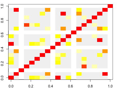
Note. As it turns out, even at this starting point in our simulation, there can be a bit of LD. It arises due to our finite set of starting haplotypes.
Now plot the LD for the final generation and compare to the original:
layout( matrix( 1:2, ncol = 1 ))
plot.ld( haplotypes[population[1,],] )
plot.ld( haplotypes[population[G,],] )
Question. What do you see?
Note. Depending on your simulation, you might see patterns emerging. On the other hand, you might just see lots of white (missing) LD - it depends what happened in the simulation.)
Exploring the simulations.
In the file simulation_and_visualisation.R
(also available on github)
I've wrapped up the above code into two key functions:
simulate.population()which simulates from the model as above.plot.simulation()which makes a multi-panel plot of the result.
To get this code, source() it into your session:
source( "simulation_and_visualisation.R" )
You can run it like this:
sim = simulate.population( L = 20, N = 100, G = 100 )
plot.simulation(sim)
or on one line:
plot.simulation( simulate.population( L = 20, N = 100, G = 100 ) )
It produces a plot like this:
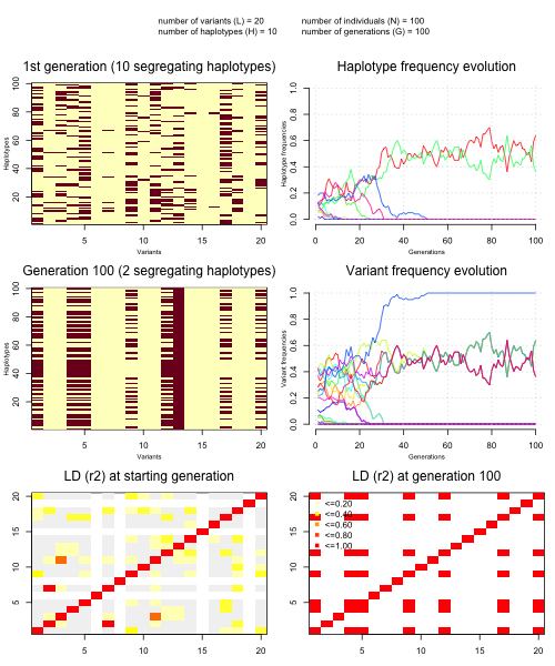
Questions
- Explore the simulations and try varying the parameters. In particular, how does varying the population size affect the simulations?
Note. Remember that is the number of variants, is the population size, and is the number of generations. (You can also specify , the number of different haplotypes we created at the simulation start, if you want to.)
Describe in general what happens to haplotypes and variants as the simulations proceed.
What does genetic drift do to LD?
Next steps
Next let's look at some key population genetic statistics.