Visualising haplotypes in R
In this page you will load up some real haplotype data (from the 1000 Genomes Project) and plot it in R.
Start by downloading the file GWD_30x_calls.filtered.tsv.gz from this folder and loading into R:
gwd = readr::read_tsv( "https://www.chg.ox.ac.uk/bioinformatics/training/gms/data/GWD_30x_calls.filtered.tsv.gz" )

print(gwd)
Have a look at the data. The data consists of genotype calls for 112 'Gambian from the Western Division' individuals from the recent high-coverage sequencing of 1000 Genomes Project samples.
It has data for >30,000 biallelic SNPs (in rows) from the range chr19:48,146,028-49,255,722, and information for 224
haplotypes in columns (two for each individual, of course, because we are diploid).
The data comes from a region of chromosome 19 including the genes GRIN2D (which is associated with a number of neurodevelopmental disorders) and FUT2 (which encodes secretor status).
Note
If you want to see how this data was generated - see the Variant calling and imputation practical.
## Plotting the haplotypes
Let's plot this data now. To start, let's turn the genotypes themselves into a matrix. If you look at the data you'll see the first four columns are variant metadata, so let's get the rest:
metadata = gwd[,1:4]
GT = as.matrix( gwd[,5:ncol(gwd)])
To plot haplotypes, the first thing we'll do is throw out monomorphic and rare variants. (These don't look great on haplotype plots because almost everybody carries the same allele!)
frequencies = rowSums(GT) / ncol(GT)
w = which( frequencies > 0 & frequencies < 1 )
GT = GT[w,]
metadata = metadata[w,]
Question
How many variants are left?
Let's get the number of SNPs and haplotypes in the data:
L = nrow(GT) # number of SNPs
N = ncol(GT) # number of haplotypes
and plot:
image(
    GT,
    x = 1:L,
    y = 1:N,
    xlab = "SNPs",
    ylab = "Chromosomes"
)
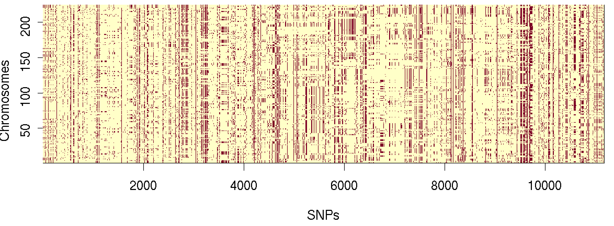
Cool!
Improving the plot
There are three ways we could improve it - we'll try two of these in this tutorial.
First, we could order the haplotypes (i.e. grouping similar haplotypes) which will help to bring out the 'haplotype structure'. We'll do this in a moment.
Second, instead of plotting reference and non-reference alleles, it would be nice to plot ancestral and non-ancestral (i.e. 'derived') alleles. Then we'd be looking at mutations directly. (We'll skip this for now., although ancestral allele calls are available, so it's possible in principle.)
The third thing it would be nice to do is plot the variants on reference sequence coordinates, with genes on there...
Plotting genes
Let's try to plot with genes now. First we need to load the genes.
Warning
This section is somewhat experimental. See how it goes and please let me know if you run into issues.
Note 1
The data in this tutorial is in build 37 coordinates. So you will need to get the build 37 version of the gencode files for this. Download the b37 version of the gff file now, for example by:
curl -O https://ftp.ebi.ac.uk/pub/databases/gencode/Gencode_human/release_47/GRCh37_mapping/gencode.v47lift37.annotation.gff3.gz
and remember where it is saved.
Now load the genes into R:
genes = gmsgff::read_gff( "/path/to/gencode.v47lift37.annotation.gff3.gz", extra_attributes = c( "gene_name", "gene_type" ) )
Note 2
To load the data like this, you will also have to have the read_gff() function. You may have
written your own,
but if not you can install my version from the gmsgffpackage. To install that now, try:
install.packages(
    "https://www.chg.ox.ac.uk/bioinformatics/training/gms/code/R/gmsgff.tgz",
    repos = NULL,
    type = "source"
)
Note 3
Plotting genes from gff is also nontrivial so I've written a function to do it - find it in this file. If you download that file, you can either paste it into your R session or load it using source():
source( 'plot_gff.R')
Great - now let's try making a multi-panel plot with the haplotypes on top and the genes underneath. Because the haplotypes are plotted in SNP index positions, we'll also need some join-y segments to show us where they are. For customised plots like this, you usually need to go low level. This tutorial uses base R graphics to do this, but the techniques should apply to other systems as well.
This is graphics so I'm going to make a layout for the plot - with the genes below the sequences. This will be a multi-panel plot, which takes a bit of care. I've found the best way to do control multi-panel plots is to
- get rid of the built-in plot margins, and
- Instead control the margins as rows in the layout of panels.
In R we can do that by creating a plot layout matrix with 0's in the rows and columns that are not plotted in.
These will form the actual margins and we'll control their widths and heights as we choose. Let's try now:
# First remove R's built-in plot margins...
par( mar = c( 0, 0, 0, 0 ))

# ...and then generate a multi-panel layout matrix
layout.matrix = matrix(
    c(
        0, 0, 0, # top margin
        0, 1, 0, # haplotypes
        0, 0, 0,
        0, 2, 0, # linking lines
        0, 0, 0,
        0, 3, 0, # genes
        0, 0, 0  # bottom margin
    ),
    byrow = T,
    ncol = 3
)
print( layout.m )
The layout() function now creates a multi-panel figure:
layout(
    layout.matrix,
    widths = c( 0.1, 1, 0.1 ),
    heights = c( 0.1, 1, 0.1, 0.5, 0.1 )
)
Having set up the layout, we now plot the panels in the order they were numbered in the layout:
# Plot 1: the haplotypes
image(
    GT,
    x = 1:L,
    y = 1:N,
    xlab = "SNPs",
    ylab = "Chromosomes"
)
For the middle panel, let's make a blank plot, and then put some line segments on. I like three-segmented line segments
here, so that's what I'll do. (This uses a blank.plot() function which makes a blank plot pane - it's in the
plot_gff.R code as well.)
# Plot 2: the joining segments
xlim = range( metadata$position )
blank.plot( xlim = xlim, ylim = c( 0, 1 ), xaxs = 'i' )

# Locations of where the SNPs will be, in physical coords and in the haplotypes
physical.pos = metadata$position
haplotype.pos = seq( from = xlim[1], to = xlim[2], length = nrow( metadata ))

# Vertical locations of the segment joins
ys = c( 0, 0.25, 0.75, 1 )

segments(
    x0 = physical.pos, x1 = physical.pos,
    y0 = ys[1], y1 = ys[2]
)
segments(
    x0 = physical.pos, x1 = haplotype.pos,
    y0 = ys[2], y1 = ys[3]
)
segments(
    x0 = haplotype.pos, x1 = haplotype.pos,
    y0 = ys[3], y1 = ys[4]
)
Finally for the last panel we'll plot the genes:
# Plot 3: the genes
plot_gff(
    genes %>% filter( end >= xlim[1] & start <= xlim[2] & type %in% c( "gene", "transcript", "exon", "CDS" )),
    region = list( chromosome = 'chr19', start = min(metadata$position), end = max( metadata$position ))
)
Phew! That's quite a bit to type so I've put that all together, with some extra tweaks, into a function which you can find here. Download that file, source it by typing...
source( 'plot_haplotypes.R' )
...and let's try it:
region = list(
    chromosome = 'chr19',
    start = 48146028,
    end = 49255722
)
plot_haplotypes(
    GT,
    metadata,
    genes,
    region = region
)
Let's also zoom in a bit to see the haplotypes around FUT2:
FUT2.region = list(
    chromosome = 'chr19',
    start = 49199228 - 50000,
    end = 49209208 + 50000
)
plot_haplotypes(
    GT,
    metadata,
    genes,
    region = FUT2.region
)
...or a slightly larger region around *GRIN2D**:
GRIN2D.region = list(
    chromosome = 'chr19',
    start = 48896925 - 100000,
    end = 48948188 + 100000
)
plot_haplotypes(
    GT,
    metadata,
    genes,
    region = GRIN2D.region
)
Very hapmap-esque!.
Ordering the haplotypes
Haplotypes plotted like that look very noisy - and not surprisingly, since the individuals are essentially in random order.
To try to make sense of them, let's use a simple approach to order the haplotypes in the region - hierarchical clustering.
In R we can do this by first constructing a distance matrix and then using hclust() to cluster it. Let's try now - we'll cluster by SNPs near the FUT2 gene:
wNearGRIN2D = which( metadata$position >= GRIN2D.region$start & metadata$position <= GRIN2D.region$end )
distance = dist(
    t(GT[wNearGRIN2D,]),
    method = "manhattan"
)
Here we've used 'manhattan' distance, that is, the distance between two haplotypes is the number of mutational differences between them.
Note
The t() part is needed around GT, otherwise we will be clustering SNPs instead of samples. (You'll know if you got
this wrong because the output will be enormous below.
You can see what the distance matrix looks like by converting to a matrix:
as.matrix(distance)[1:10,1:10]
You should see something like this:
             HG02461_hap1 HG02461_hap2 HG02462_hap1 HG02462_hap2 HG02464_hap1 HG02464_hap2 HG02465_hap1 HG02465_hap2 HG02561_hap1 HG02561_hap2
HG02461_hap1            0         1360         1894         1832         1775         1466         1977         1648         1797         2120
HG02461_hap2         1360            0         2062         1542         1753         1464         1729         1972         1765         1878
HG02462_hap1         1894         2062            0         1668         1599         1886         1615         1878         1737         1872
HG02462_hap2         1832         1542         1668            0         2003         1956         1785         1742         1717         2012
HG02464_hap1         1775         1753         1599         2003            0         1883         1876         1791         1946         2055
HG02464_hap2         1466         1464         1886         1956         1883            0         1895         1788         1679         1656
HG02465_hap1         1977         1729         1615         1785         1876         1895            0         2137         1838         1845
HG02465_hap2         1648         1972         1878         1742         1791         1788         2137            0         1725         2126
HG02561_hap1         1797         1765         1737         1717         1946         1679         1838         1725            0         1935
HG02561_hap2         2120         1878         1872         2012         2055         1656         1845         2126         1935            0
Now let's cluster and order them using hclust():
sample_order = hclust( distance )$order
Let's plot again - this time ordering the columns (haplotypes) in the data:
plot_haplotypes(
    GT[,sample_order],
    metadata,
    genes,
    region = GRIN2D.region
)
Note
Wouldn't it be better to put that sorting code into a function? It would!
order_haplotypes <- function( haplotypes, metadata, region ) {
    wInRegion = which( metadata$position >= region$start & metadata$position <= region$end )
    distance = dist(
        t(haplotypes[wInRegion,]),
        method = "manhattan"
    )
    return( hclust( distance )$order )
}
Feel free to explore other regions within the data.
The frequency of variants
How much variation is there? Here are a few ways to look at it.
First we could look at the frequencies of all the variants in the data:
par( mfrow = c( 1, 1 ), mar = c( 4.1, 4.1, 4.1, 4.1 ))
frequencies = rowSums( GT ) / ncol( GT )
hist(
    frequencies,
    breaks = 25,
    xlab = "Alt allele frequency",
    ylab = "Count",
    main = "Site frequency spectrum"
)
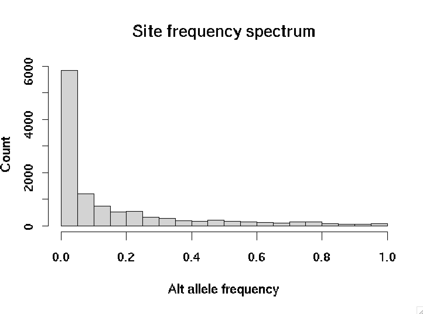
This picture is typical - most variant alleles are rare, and only a few are common.
Note
These are the frequencies at variable sites only. If we computed at every site, there would be an even bigger spike at zero - counting all the sites that are not variable between people in our data. (How many of these are there in this region?)
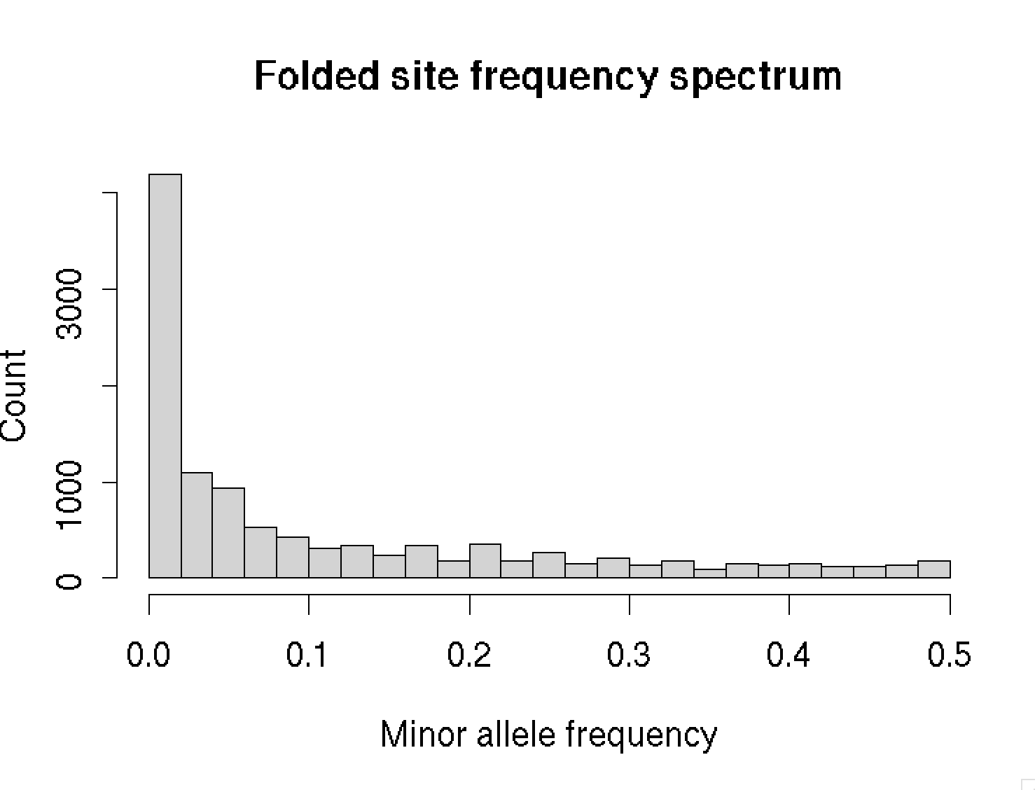
This picture is for alternate alleles (versus reference alleles). A better plot would show the frequencies of derived alleles (i.e. those that have arisen trhough mutation compared to the common ancestor). To do that, we would need a call of the ancestral allele - which we haven't loaded right now. So instead let's plot hte folded site frequency spectrum, where we ignore the difference:
hist(
    pmin( frequencies, 1 - frequencies ),
    breaks = 25,
    xlab = "Minor allele frequency",
    ylab = "Count",
    main = "Folded site frequency spectrum"
)
Computing diversity
A natural metric is to measure 'how much variation' there is by computing the average number of mutations that separate different haplotypes - average number of pairwise differences, also known as nucleotide diversity.
To do this we'll write a function which loops over all pairs of haplotypes in the data.
Note
How many pairs of distinct haplotypes are there? The answer is of course the number of ways of drawing two things from things - known as ' choose 2':
...also known as the 2nd diagonal in pascal's triangle:
N
0           1
1         1   1   ↙
2       1   2   1
3     1   3   3   1
4   1   4   6   4   1
          etc.
In R, you can compute this using the choose() function - or just do N*(N-1)/2 as above, which is what I've done in
the function below.
and so on.
average_number_of_pairwise_differences = function(
    haplotypes
) {
    N = ncol(haplotypes)
    total = 0
    # Sum over all pairs
    # There are of course much faster ways to do this!
    for( i in 1:(N-1) ) {
        for( j in (i+1):N ) {
            a = haplotypes[,i]
            b = haplotypes[,j]
            total = total + sum( a != b )
        }
    }
    # Divide by the total number of pairs
    return( total / (N*(N-1)/2))
}

average_number_of_pairwise_differences( GT )
1811.239
So haplotypes differ by about 1800 mutations on average, across this 1.1Mb region - or about 1.6 mutations per kilobase.
Challenge questions
Here are some challenges:
Challenge 1
Pick other genes in the region and make a version of the haplotype plot that shows all haplotypes, but the ordering is based only on the SNPs in the gene, or a small region around it.
Challenge 2
Do haplotypes carrying the alternate allele at the SNP rs601338 (at chr19:49206674 in FUT2), which determines secretor
status, look different from those that don't? Try plotting just the haplotypes carrying each allele.
Challenge 3
Plot an LD matrix (i.e. a matrix of pairwise correlations between different variants). Can you see the block-like structure?
Good luck!