Meta-analysing two studies.
Up to the table of contents / Back to the Introduction / Forward to the fine-mapping section
Conducting fixed-effect meta-analysis
The simplest way to perform meta-analysis is as follows. We assume:
- that the true effect is the same in both studies.
- that the observed effect in each study is equal to the true effect plus noise. (The noise is given by the study standard error, and is assumed to be gaussian in the usual way.)
The full name of this is inverse variance weighted fixed-effect meta-analysis.
Here's how it works: form a weighted average of the effect estimates, weighted by the inverse of the variances:
Compute also the sum of weights:
Then the meta-analysis estimate is
and the meta-analysis standard error is
Note
There are two good reasons to compute the estimate this way. Firstly, it makes sense: the meta-analysis estimate is a weighted average of the per-study estimates, and they are weighted by the variance. So studies with lots of uncertainty (large variance) get weighted down while studies with little uncertainty (small variance) get higher weight.
The second reason is that, as it turns out, this meta-analysis estimate is precisely what you would have computed if you had estimated using all the data together** (at least approximately). The maths behind this is based on the remarkable fact that products of normal distributions are also normal distributions. If we approximate the likelihood function from each study by a normal - that is, by its estimate and standard deviation - then it turns out that this product is a new normal density, and it has exactly the meta-analysis estimates as mean and standard deviation.
Running the meta-analsis
Here is a function to run the meta-analysis from our two studies:
meta.analyse <- function( beta1, se1, beta2, se2 ) {
  inverse.variances = c( 1/se1^2, 1/se2^2 )
  b = c( beta1, beta2 ) * inverse.variances
  meta.inverse.variance = sum( inverse.variances )
  meta.beta = sum( b ) / meta.inverse.variance
  meta.se = sqrt( 1 / meta.inverse.variance )

  # This formulation computes a two-tailed P-value
  # as discussed in lectures
  meta.P = pnorm( -abs( meta.beta ), sd = meta.se ) * 2

  # This formulation computes a Bayes factor under a N(0,0.2^2) prior
  meta.BF = (
    pnorm( meta.beta, mean = 0, sd = sqrt( meta.se^2 + 0.2 ) ) /
    pnorm( meta.beta, mean = 0, sd = meta.se )
  )

  return( list(
    meta.beta = meta.beta,
    meta.se = meta.se,
    meta.P = meta.P,
    log10_meta.BF = log10( meta.BF )
  ))
}
Try it on some fake data, for example:
> meta.analyse( beta1 = 1, se1 = 0.1, beta2 = 1, se2 = 0.1 )
Try a few different input values. You should see:
- The meta-analysis estimate should be somewhere between the two input estimates.
- The meta-analysis standard error should be smaller than either of the two study standard errors.
- The meta-analysis P-value depends on how well the two estimates 'stack up' on each other. If they are both in the same direction and of roughly comparable size, the P-value will be lower than either of the study P-values.
Here is a way to run the above function across all the data in our study.
Note. We will use the purrr function map_dfr() to run the
above function across all rows and return a data frame. If you don't have purrr, you could use a
base R function like lapply() instead.
meta_analysis = map_dfr(
  1:nrow(study1),
  function( i ) {
    c(
      rsid = study1$rsid[i],
      chromosome = study1$chromosome[i],
      position = study1$position[i],
      allele1 = study1$allele1[i],
      allele2 = study1$allele2[i],
      study1.beta = study1$beta[i],
      study1.se = study1$se[i],
      study1.P = study1$P[i],
      log10_study1.BF = study1$log10_BF[i],
      study2.beta = study2$beta[i],
      study2.se = study2$se[i],
      study2.P = study2$P[i],
      log10_study2.BF = study2$log10_BF[i],
      meta.analyse(
        study1$beta[i], study1$se[i],
        study2$beta[i], study2$se[i]
      )
    )
  }
)
Question
What does the meta-analysis look like for the 'top' SNPs (e.g. those with the lowest P-values or highest Bayes factors) in study1 or 2? Is the evidence stronger or weaker across studies? Has the meta-analysis changed the SNP or SNPs with the strongest evidence? Why?
Hint. One way to pull out the 'top' SNps is to use the order() function. For example to pull
out the results for the ten SNPs with the lowest P-values in study 1, in order:
meta_analysis[ order( meta_analysis$study1.P )[1:10], ]
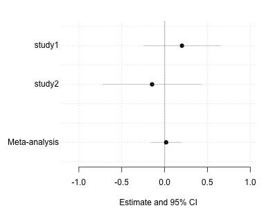
Making a forest plot
To make best sense of this the tool for the job is a forest plot. We plot the study estimates and the meta-analysis estimate, along with their confidence/credible intervals, on seperate lines. Let's do that now. First here's our utility function to make a blank canvas:
blank.plot <- function( xlim = c( 0, 1 ), ylim = c( 0, 1 ), xlab = "", ylab = "" ) {
  # this function plots a blank canvas
  plot(
    0, 0,
    col = 'white', # draw points white
    bty = 'n',     # no border
    xaxt = 'n',    # no x axis
    yaxt = 'n',    # no y axis
    xlab = xlab,   # no x axis label
    ylab = ylab,   # no x axis label
    xlim = xlim,
    ylim = ylim
  )
}
Now let's make a general forest plot function:
draw.forest.plot <- function(
  betas,
  ses,
  names
) {
  # y axis locations for the lines.
  # We assume the meta-analysis will go on the last line, so we separate it slightly by putting it at 1/2
  y = c( length(betas):2, 0.5 )

  # learn a good x axis range by going out 3 standard errors from each estimate:
  xlim = c( min( betas - 3 * ses ), max( betas + 3 * ses ))
  # Also let's make sure to include zero in our range
  xlim[1] = min( xlim[1], 0 )
  xlim[2] = max( xlim[2], 0 )

  # expand the range slightly
  xcentre = mean(xlim)
  xlim[1] = xcentre + (xlim[1] - xcentre) * 1.1
  xlim[2] = xcentre + (xlim[2] - xcentre) * 1.1

  # Give ourselves a big left margin for the row labels
  par( mar = c( 4.1, 6.1, 2.1, 2.1 ))
  blank.plot(
    xlim = xlim,
    ylim = c( range(y) + c( -0.5, 0.5 )),
    xlab = "Estimate and 95% CI"
  )

  # Draw the intervals first so they don't draw over the points
  segments(
    x0 = betas - 1.96 * ses, x1 = betas + 1.96 * ses,
    y0 = y, y1 = y,
    col = 'grey'
  )

  # Now plot the estimates
  points(
    x = betas,
    y = y,
    col = 'black',
    pch = 19
  )

  # ... and add labels.  We put them 10% further left than the leftmost point
  # and we right-align them
  text.x = xcentre + (xlim[1] - xcentre) * 1.1
  text(
    x = text.x,
    y = y,
    labels = names,
    adj = 1, # right-adjust
    xpd = NA # this means "Allow text outside the plot area"
  )

  # Add an x axis
  axis( 1 )

  # add grid lines
  grid()

  # add a solid line at 0
  abline( v = 0, col = rgb( 0, 0, 0, 0.2 ), lwd = 2 )
}
For example, we could now make a forest plot for the first SNP:
  forest.plot <- function( row ) {
    betas = c( row$study1.beta, row$study2.beta, row$meta.beta )
    ses = c( row$study1.se, row$study2.se, row$meta.se )
    names = c( "Study 1", "Study 2", "Meta-analysis" )
    draw.forest.plot( betas, ses, names )
  }

  forest.plot( meta_analysis[1,] )
Question
What does the forest plot look like for the 'top' SNPs, i.e. for those with the lowest P-values (or highest Bayes factors)? Plot a few of them and look at them. Make sure you understand how the data in the meta-analysis file corresponds to the data on the plot.
Note. Forest plots are deceptively simple - they don't look like there's much going on, but whenever I try to draw one I
find it takes quite a bit of code. (Like the draw.forest.plot() function above, which already has ~40 lines of code). This
is typical of visualisation in general - the code always gets lengthy - and I think it is not really surprising. It is because
in a visualistion you are trying to convey a great deal of information clearly in a small space: this often takes great deal
of careful tweaking to get right. Don't skimp on this!
Challenge
For a "working" plot, one thing it might be good to add to the plot would be more text listing the numerical values (i.e. the estimate and 95% confidence intervals) E.g. this code:
labels = sprintf(
  "%.2f (%.2f - %.2f)",
  betas,
  betas - 1.96 * ses,
  betas + 1.96 * ses
)
produces the right kind of text. Can you add this to the plot in the right place?
Other meta-analysis models
The above is a simple meta-analysis that assumes that the true effect is the same in both studies. However, as we saw in the lecture, more complex models are also possible, including a 'random' effects analysis (that assumes that true effects are normally distributed around some mean) and include a heterogeneity test. Here is a way to do this.
First, you will need to install the meta library: run
install.packages("meta")
or use the Tools -> Install Packages menu in Rstudio.
We can then run a random-effect meta-analysis like this:
library(meta)
forest.meta(
  metagen(
    c( study1$beta[1], study2$beta[1] ),
    c( study1$se[1],study2$se[1] )
  )
)
Question
What does this look like for the most-associated SNPs? Is there any evidence of differences in effect between studies?
Fine-mapping the association
By now you should have a good sense of which SNPs have lots of evidence for association in the two studies - and maybe these are the 'causal' SNPs. However, an obvious possibility (if the gene is relevant for the disease) is that there could be multiple causal SNPs. In the next section we will see one way to try to discover how many causal SNPs there are - and what they are.