Bring on the violins
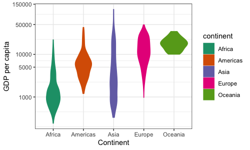
Density plots like this look kindof nice, but can be difficult to interpret with many groups overlaid over each other. Another way to plot multiple densities is a violin plot.
To make one, we'll reorganise the plot to have the continent on the x axis and the gdp distribution on the y axis. And, just for ease of identification we'll keep the colours as well:
p2_2b <- ggplot(data = d, mapping = aes(x = continent,
                                        y = gdpPercap,
                                        color = continent,
                                        fill = continent)) +
  geom_violin() +
  scale_y_continuous(trans = "log10",
                     breaks = c(0, 1000, 5000, 10000, 50000, 150000)) +
  scale_color_brewer(palette = "Dark2") +
  scale_fill_brewer(palette = "Dark2") +
  labs(x = "Continent", y = "GDP per capita")

p2_2b

We can also get rid of the legend since it doesn't add any new information:
p2_2b + theme(legend.position = "none")
Note
I like this plot with colours, but it does break one of the cardinal rules of data visualisation. This is that it's best to map one feature of the data to one aesthetic (whereas here we have mapped continent to two: the x axis and colour at the same time.)
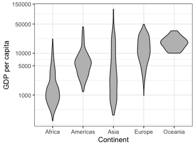
Arguably as a scientific plot (as opposed to a presentation tool) this is better without the colours:
print(
    ggplot(data = d, mapping = aes(x = continent, y = gdpPercap))
    + geom_violin( fill = 'grey' )
    + scale_y_continuous(trans = "log10",
                       breaks = c(0, 1000, 5000, 10000, 50000, 150000))
    + labs(x = "Continent", y = "GDP per capita")
)

...because the colours distract from the distributions. (But to demo the possibilities we'll stick with the colours for now.)