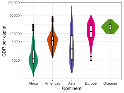
Adding summary statistics
These violins are essentially vertically-plotted, back-to-back histograms. They are pretty useful and look good, but don't directly provide any quantification. To improve that, let's also add some summary statistics such as the median and the inter-quartile range (IQR) as a boxplot on top of the violins. Remember that we set the fill and color to match continents in the overall plot aesthetics, so if we don't override that here, the overlaid boxplots will have the same fill and color as the violins.
p2_2b +
  geom_boxplot(width = 0.1, color = "black", fill = "white") +
  theme(legend.position = "none")

Sweet! This illustrates an important feature of ggplot2: the aesthetic mapping can be set on the plot object itself, but can also be set (or overridden) seperately for each layer, allowing great flexibility in the plot appearance.