Reordering values
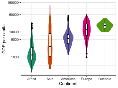
To make this plot easier to read, let's order the plots by median GDP per capita.
To do this in ggplot takes a bit of data manipulation - essentially, we tell ggplot what order we
want continents in by ordering them in the data itself. To do this we will reorder the levels of
the continent variable. This works because continent is actually a factor - discrete
values with a specific set of levels. You can see them using the levels function:
levels(d$continent)
Right now they are in alphabetical order. Let's use dplyr to add a new column with the same
continent in, but now ordered by per capita gdp:
d$orderedContinent = reorder( d$continent, d$gdpPercap, FUN = median )
You should see something like:
# A tibble: 1,704 × 7
   country     continent  year lifeExp      pop gdpPercap orderedContinent
   <fct>       <fct>     <int>   <dbl>    <int>     <dbl> <fct>
 1 Afghanistan Asia       1952    28.8  8425333      779. Asia
 2 Afghanistan Asia       1957    30.3  9240934      821. Asia
 3 Afghanistan Asia       1962    32.0 10267083      853. Asia
 4 Afghanistan Asia       1967    34.0 11537966      836. Asia
 5 Afghanistan Asia       1972    36.1 13079460      740. Asia
 6 Afghanistan Asia       1977    38.4 14880372      786. Asia
 7 Afghanistan Asia       1982    39.9 12881816      978. Asia
 8 Afghanistan Asia       1987    40.8 13867957      852. Asia
 9 Afghanistan Asia       1992    41.7 16317921      649. Asia
10 Afghanistan Asia       1997    41.8 22227415      635. Asia
# … with 1,694 more rows
# ℹ Use `print(n = ...)` to see more rows
Importantly the new variable is in a different order: $ levels(d$orderedContinent) [1] "Africa" "Americas" "Asia" "Europe" "Oceania"
So let's plot - don't forget to update to use the new orderedContinent variable:
  ggplot(
    data = d,
    mapping = aes(
      x = orderedContinent,
      y = gdpPercap,
      color = orderedContinent,
      fill = orderedContinent)
  ) +
  geom_violin() +
  geom_boxplot( width = 0.1, color = "black", fill = "white" ) +
  scale_y_continuous(trans = "log10",
                     breaks = c(0, 1000, 5000, 10000, 50000, 150000)) +
  scale_color_brewer(palette = "Dark2") +
  scale_fill_brewer(palette = "Dark2") +
  labs(x = "Continent", y = "GDP per capita") +
  theme(legend.position = "none")

Note
A fancier way to make these data manipulations is to use dplyr to "pipe" the data through
mutating functions. The %>% syntax is used for this (kindof similar to how the | character is
used in the UNIX shell). Mutating the dataframe on the fly would look like this:
d %>% mutate(
    orderedContinent = reorder(continent, gdpPercap, FUN = median)
)
It's also possible to pipe the output straight into ggplot - in this case we skip the data
argument as the data is piped in:
d %>% mutate(
    orderedContinent = reorder(continent, gdpPercap, FUN = median)
) %>% ggplot(
  mapping = aes( ... )
  ...(etc.)
Whether this is clearer or not is a matter of personal preference - it certainly can make for shorter code.