Other plots - and a challenge
There are of course lots of other ways we could visualise this data -
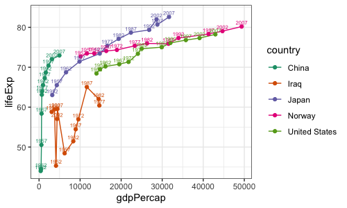
for example here is a plot using geom_line to focus on a few countries over time:
print(
  ggplot(
    data = d[ d$country %in% c( 'Japan', 'China', 'Norway', 'United States', 'Iraq' ), ],
    mapping = aes( x = gdpPercap, y = lifeExp, colour = country )
  )
  + geom_line()
  + geom_point()
  + geom_text( aes( label = year ), nudge_x = 0, nudge_y = 1, size = 2 )
  + scale_color_brewer(palette = "Dark2")
)

The sky is the limit - hopefully this tutorial has given you a start in how to explore the possibilites. Read the ggplot2 documentation for many more ideas.
Now try it yourself!
Another dataset that is fun to visualise is the "Palmer penguins" dataset, described further here. Let's load it now:
library(palmerpenguins)
d <- penguins
Challenge
Use your R / ggplot2 visualisation skills to explore this dataset.