Labelling points
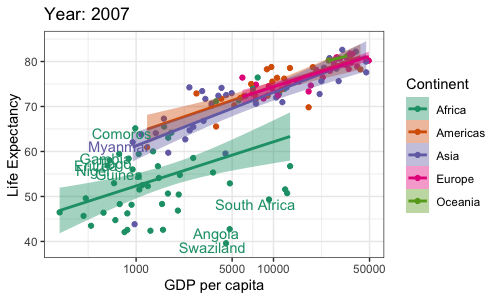
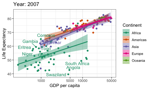
If you look back at this plot of GDP versus life expectancy, you'll see that some countries seem to buck the overall trend. It would be useful to label them so we can see what they are.
Let's try that now. We'll use some thresholds based on the above plot to pick countries for labelling:
dat_label <- d07[
  (d07$gdpPercap > 3000 & d07$lifeExp < 50)
  | (d07$gdpPercap < 1000 & d07$lifeExp > 55),
]
This is countries with high per-capita gdp but low life expectancy, or vice versa - if you look at this dataframe you'll see there are 10 of them. Let's add them to our plot:
p2_3c <- p2_3b +
# for the label layer, let's jsut use the subsetted data.
# Setting position nudge moves the labels away from the points
geom_text(
  data = dat_label,
  aes(label = country),
  position = position_nudge(x = -0.1, y = -1),
  show.legend = F
)
p2_3c

Note
Despite the 'nudge', some of the labels are still on top of each other. One thing to try is the
geom_text_repel() geom which is provided by the ggrepel package instead. Install it like this:
install.packages( 'ggrepel' )
And now you can write:
p2_3b +
# for the label layer, let's jsut use the subsetted data.
# Setting position nudge moves the labels away from the points
geom_text_repel(
  data = dat_label,
  aes(label = country),
  show.legend = F
)

ggrepel has moved the labels off each other. (Still, it's still not totally obvious which points
go with with label. In general you can spend a lot of time getting labels like this in the right
places - we'll leave it there for now.)