Is gdp related to life expectancy?
In the above we've been looking at the distribution of gdp across all years in the data.
But now let's focus on a single year:
d07 <- d[d$year == 2007, ]
and ask if the variables are related to each other.
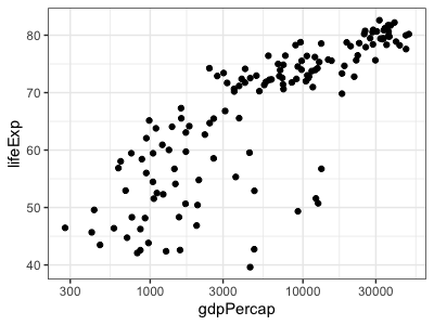
The simplest and often best way to show the relationship between two variables is a scatter plot. A basic scatter plot is easy:
print(
  ggplot( data = d07, aes( x = gdpPercap, y = lifeExp ))
  + geom_point()
  + scale_x_continuous(trans = "log10")
)

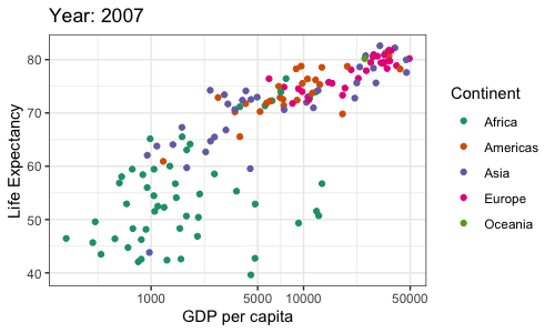
However, we already suspect this may differ by continent so let's colour by continent - and fix up the axis labels etc. as we have been doing:
p2_3a <- ggplot(
  data = d07,
  mapping = aes(x = gdpPercap, y = lifeExp, colour = continent)
) +
geom_point() +
scale_color_brewer(palette = "Dark2") +
# we know GDP per capita is best viewed on a log scale
scale_x_continuous(trans = "log10",
                     breaks = c(0, 1000, 5000, 10000, 50000, 150000)) +
labs(
  x = "GDP per capita",
  y = "Life Expectancy",
  color = "Continent",
  title = "Year: 2007"
)

p2_3a

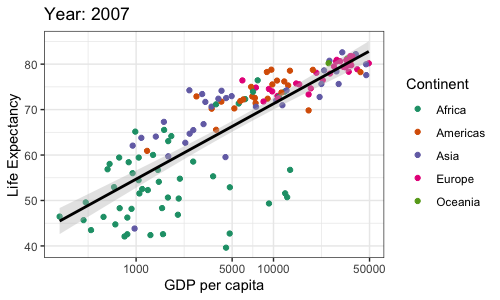
It looks like there is a trend here! let's plot some trend lines with geom_smooth - starting with a simple linear model.
p2_3a + geom_smooth(method = "lm",
                    color = "black", fill = "grey")

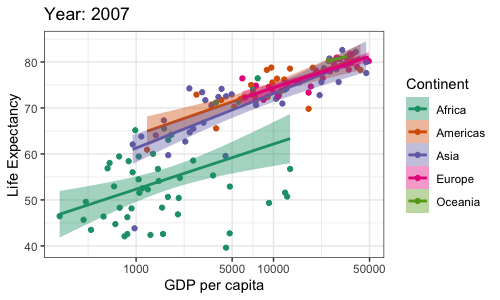
We can even fit a separate regression line to each continent.
p2_3b = p2_3a + geom_smooth(aes(color = continent, fill = continent),
                    method = "lm") +
  scale_fill_brewer(palette = "Dark2") +
  labs(color = "Continent", fill = "Continent")
p2_3b

That's pretty interesting. In all the continents this data suggests a strong relationship between per-capita GDP and life expectancy across countries, with (visually at least) similar slopes.