A first look at Gapminder data
We'll use real population data from gapminder.org. To load it, load
the gapminder library:
library(gapminder)
The gapminder data is now in a variable called gapminder - we'll use this a lot so let's start by
renaming it to something shorter:
d <- gapminder
View(d)
# or just head(d) if not in RStudio
What's Gapminder?
The data contains measurements of life expectancy, population size, and gross domestic product
(GDP) per capita for different years. The simplest way to see what's in there is to create some
summaries using the table function:
table( d$year )
length( unique( d$country ))
Evidently the data contains entries for 12 years (with 5-year gaps between) and 142 countries. Are all 142 countries represented at all 12 timepoints?
stopifnot( nrow(d) == (12 * 142) )
View( table(d$country, d$year) )
Yes they are!
A warmup plot
As a warmup let's use ggplot to show the distribution of the continuous variables in the data:
p = ggplot( data = d )
print( p + geom_histogram( aes( x = lifeExp ), bins = 25 ))
print( p + geom_histogram( aes( x = gdpPercap ), bins = 25 ))
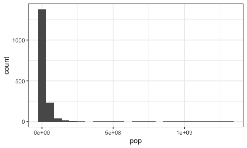
print( p + geom_histogram( aes( x = pop ), bins = 25 ))
This code illustrates how ggplot2 works: it creates a plot object (p above) that is associated
with some data; then 'layers' are added to draw things, such as the histogram layer above. What's
more, the layers are associated with aesthetic mappings (aes() in the above) which tell ggplot
how the data variables should be mapped onto visual parameters (that is, things like bar height,
point size or colour, say.) It should look something like this:

A less obvious but essential feature is that the way these data -> visual mappings are presented is
governed by scales. In the above, the scales are implicit (both x and y scales are linear). But
for example, we could alter the x scale of our plot so that bars are drawn in log space:
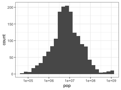
print(
    p
    + geom_histogram( aes( x = pop), bins = 25 )
    + scale_x_log10()
)

Compare these last two plots - it might take you a few moments to see exactly what has happened. If
you compare the x axes you'll see that they both have the same overall range - they go roughly up
to 1e09 (whjich of course means , i.e. 1 billion.) But in the second plot every
tick represents a point 10 times larger than the one below, that is, it is a log scale, while in
the first version the scale is linear.
Questions
Which version of the plot does a better job of presenting the data?
Look at the histogram bars. Is the histogram binning done before the transformation to log-scale, or after it?
A subtly different plot is produced if we log-transform the data instead of changing the scale:
print(
    p
    + geom_histogram( aes( x = log10(pop)), bins = 25 )
)
The plotted bars themselves look identical, but if you look closely you'll see the X axis scale has changed to reflect the log values instead. Which one of these is better probably depends on the context.
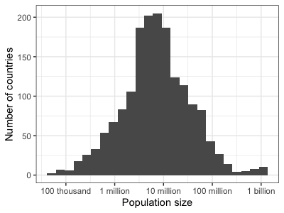
For me, neither of the above plots is perfect - I want a plot that can be understood at a glance, which means including very clear axis labels. Something like:
print(
    p
    + geom_histogram( aes( x = pop), bins = 25 )
    + scale_x_log10(
        breaks = 10^c( 5, 6, 7, 8, 9 ),
        labels = c(  "100 thousand", "1 million", "10 million", "100 million", "1 billion" )
    )
    + xlab( "Population size" )
    + ylab( "Number of countries" )
)

Question
Most countries in this data have between about 1 and 100 million individuals in - a few have much larger or smaller populations. Only two countries have populations larger than a billion. What are they? Try finding out:
d[ d$pop > 1E9 & d$year == '2007', ]
In the rest of this tutorial we'll use ggplot2 to explore the gapminder dataset in more detail.
tip
As with other R objects, you can find documentation on ggplot2 using R's in-built help - for example to find out how the above works:
?scale_x_log10
ggplot2 also has extensive online documentation including a useful cheatsheet.