Facetting
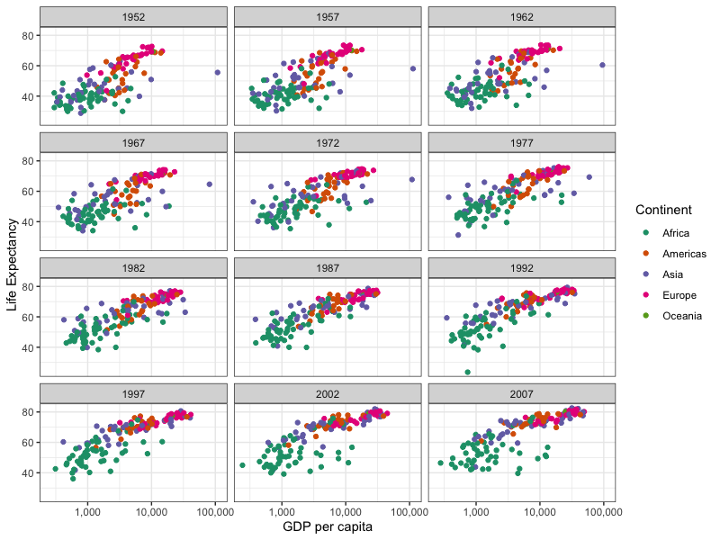
Right now our plot only shows one year of the data. What if we want to show all years at once? We'd like a way to split the plot into several panes. This is what facets are designed for.
Let's give it a go using the
facet_wrap() command. This tells
ggplot2 to split up the plot based on the value of a (categorical) variable - and arrange them as
multiple panes wrapping into a larger plot.
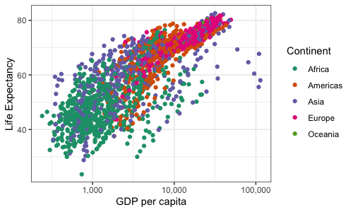
First, let's plot the data without the facet applied.
p2_3d <- (
  ggplot(
    data = d,
    mapping = aes(x = gdpPercap, y = lifeExp,  color = continent)
  ) +
  geom_point() +
  scale_color_brewer(palette = "Dark2") +
  # the scales::comma parameter changes the way axis ticks are displayed
  scale_x_continuous(trans = "log10", labels = scales::comma) +
  labs(
    x = "GDP per capita",
    y = "Life Expectancy",
    color = "Continent"
  )
)

p2_3d

Not surprisingly it's pretty messy because all the data is on the same pane. Now let's add the facet:
p2_3d + facet_wrap(~year, nrow = 4, ncol = 3)

Finally let's also save this plot to a tiff and specify plot dimensions and resolution - useful for publications:
ggsave(
  plot = p2_3d + facet_wrap(~year, nrow = 4, ncol = 3),
  filename = "gdp_vs_lifeexp_allyears.tiff",
  units = "cm",
  height = 23,
  width = 16.8,
  dpi = 300
)
Questions
One of the Asian countries is a huge outlier - very high GDP from the 1950s onwards. Which is it?
Another country has especially low life expectancy 1992 - which is it?
What happens if you facet by country instead is this useful?
Can you add outlier labels to this plot as we did before?