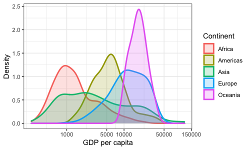
The distribution of GDP per capita, by continent
Now we have another variable we want to add: continent. In a density plot, we can't add another variable along the y-axis - so another way to show a different variable is to use colour.
Here, I assign both color and fill to continent to shade the area under the density plot.
p2_2a <- ggplot(data = d, mapping = aes(x = gdpPercap,
                                        color = continent,
                                        fill = continent)) +
  # the "alpha" parameter changes the transparency of the fill
  # the "size" parameter changes the thickness of the lines
  geom_density(alpha = 0.2, size = 1) +
  # keep the log scaling we applied previously
  scale_x_continuous(trans = "log10",
                     breaks = c(0, 1000, 5000, 10000, 50000, 150000)) +
  # change the labels for color and fill (which label the legend)
  labs(x = "GDP per capita", y = "Density",
       color = "Continent", fill = "Continent")

p2_2a

Let's change the colour scheme. People who are colour-blind do science, so let's try to keep plots colour-blind friendly
display.brewer.all(colorblindFriendly = T)
Since the continents are nominal (not ordered), we should use one of the qualitative color palettes (Set2 or Dark2) rather than a sequential one.
p2_2a + scale_color_brewer(palette = "Dark2") +
  scale_fill_brewer(palette = "Dark2")