The distribution of GDP per capita
In the rest of this tutorial we'll show various ways to create good-looking visualisations with this data. Let's get started.
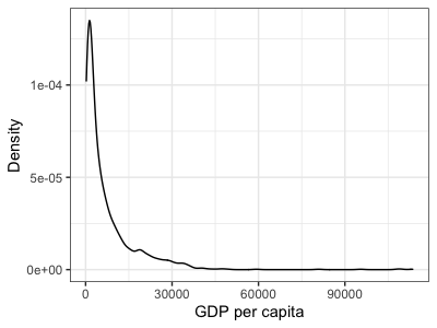
Histograms are ok - they summarise the empirical distribution of data in a largely transparent way. However they look a bit jaggedy - the true distribution is probably a lot smoother than that. One option is instead to plot a smoothed histogram, or density plot. That's easy with ggplot - let's plot the GDP per capita this way:
p2_1 <- ggplot(data = d, mapping = aes(x = gdpPercap)) +
  geom_density() +
  labs(x = "GDP per capita", y = "Density")

p2_1

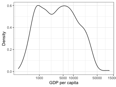
As before let's change the scale of the x-axis to a log scale
p2_1 + scale_x_continuous(trans = "log10")
# or scale_x_log10()
...and make the axis breaks prettier
p2_1 + scale_x_continuous(
    trans = "log10",
    breaks = c(0, 1000, 5000, 10000, 50000, 150000)
)

Nice! But hmm... this is a bit odd looking - it has has at least two bumps. Let's next try to see if this is caused by the distribution of GDP per capita differing in different continents.